Sunday 18 October 2020

When you are not feeling “it”


An artist friend of mine recently uploaded a post on Facebook about the story behind one of her paintings. She described how she knew she wasn’t feeling “it” as soon as she sat down to work with the prompts she had been given for the piece. She struggled all the way though the sketching process and then decide she would try to see if the piece got any better with added colour.
I saw the painting, and I saw nothing wrong with it; in fact I would be so glad to be able to scetch like she is able to. 

But then, we all have our own little inner critic to battle with at times. Yes, we all have this inner voice that complains about how the piece looks and how it is different from how we imagined it or how it doesn’t live up to our own (often unrealistic) standard. To not be discouraged when the critic torments us is a difficult task, and there is no shame whatsoever in walking away from a piece for a while and getting back to it or starting it from scratch later.

I have had two episodes like this over the last 6 months or so, a time that was more than difficult for a lot of us on a global scale. And for some it was hard and at the same time a lesson in how our personal circumstances can actually change depending on our own personal viewpoint. That is how the following girl came into being.

I have a difficult relationship the influence that the starsign Taurus has in my personal life: I am a stay at home mom to lots of kids (domesticated) and at the same time I know the longing for ... something else, more exciting, more exceptional, more... Hollywoody...
Basically a lot of the greener grass somewhere else.
But what if I can not escape? At no point during the day, not in mind or in body? And what if a lot of external influences and duties are at the same time removed like driving kids to and from school, listening to teachers complain about your child every single day, driving to sports things and whatnot? Take all that away, and you have 
a.) a recipe for disaster
b.) an actual chance to see your whole family in a new light
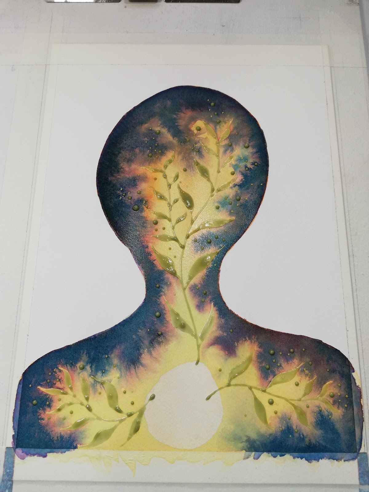
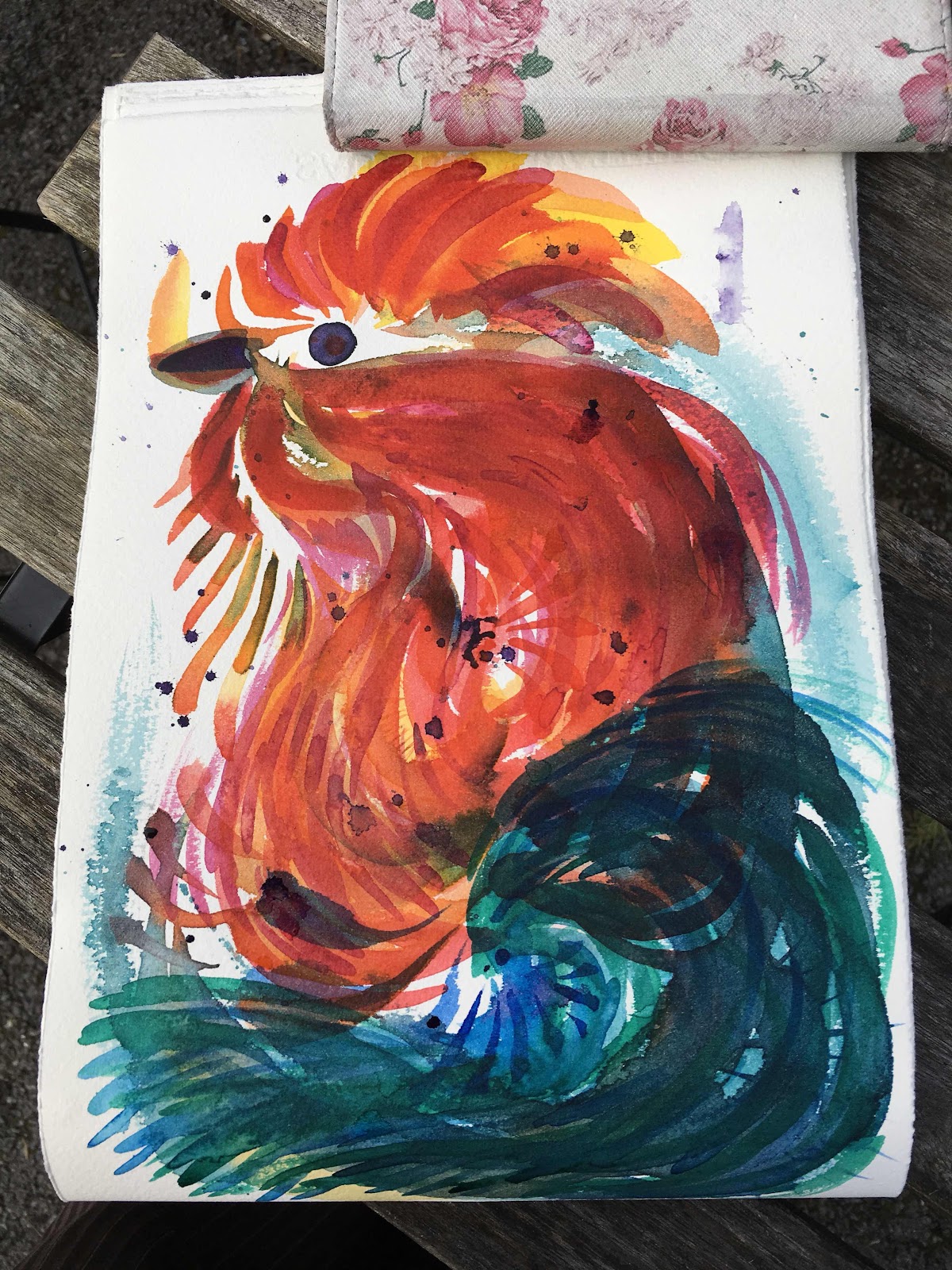
When I noticed the opportunity of b I thought of this girl, in front of the moon because most changes are happening hidden and out of sight, and I gave her cows horns for the domestic influence of Taurus.


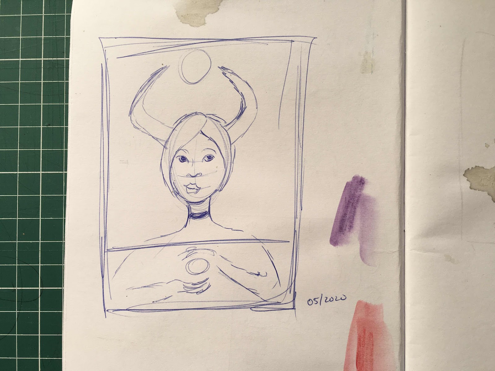
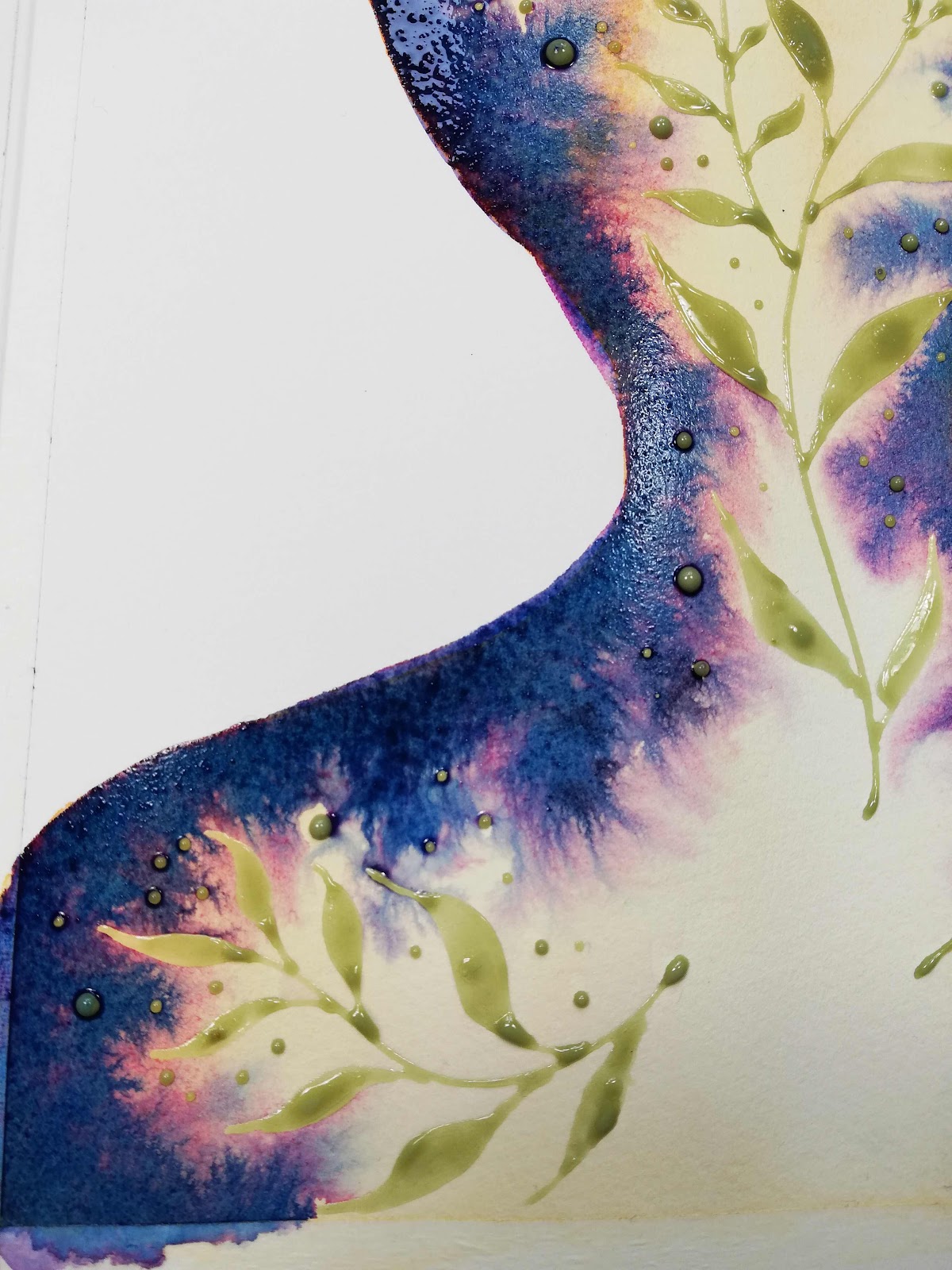
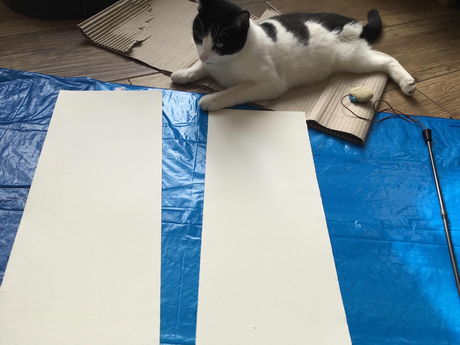
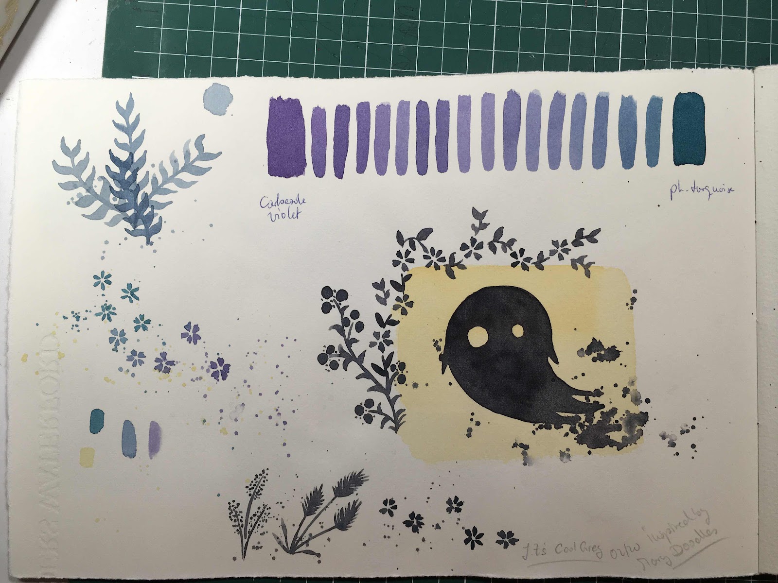
I had to really fight with myself and against myself to actually make the time for art and my own wellbeing. And as soon as I sat down and had her outlined and the first layer put down with NeoPastel watersoluble crayons and acrylics I knew she would turn out all wrong! The supplies I was using were not working for me that day and I hated them and the painting as it grew. It was so frustrating and demotivating, especially since I do not have a daily drawing practise and thus want to make all my paintings to turn out as well as possible. Also the paper I used wasn’t small either, slightly bigger than A3 and I did not want to have wasted a large piece of paper.


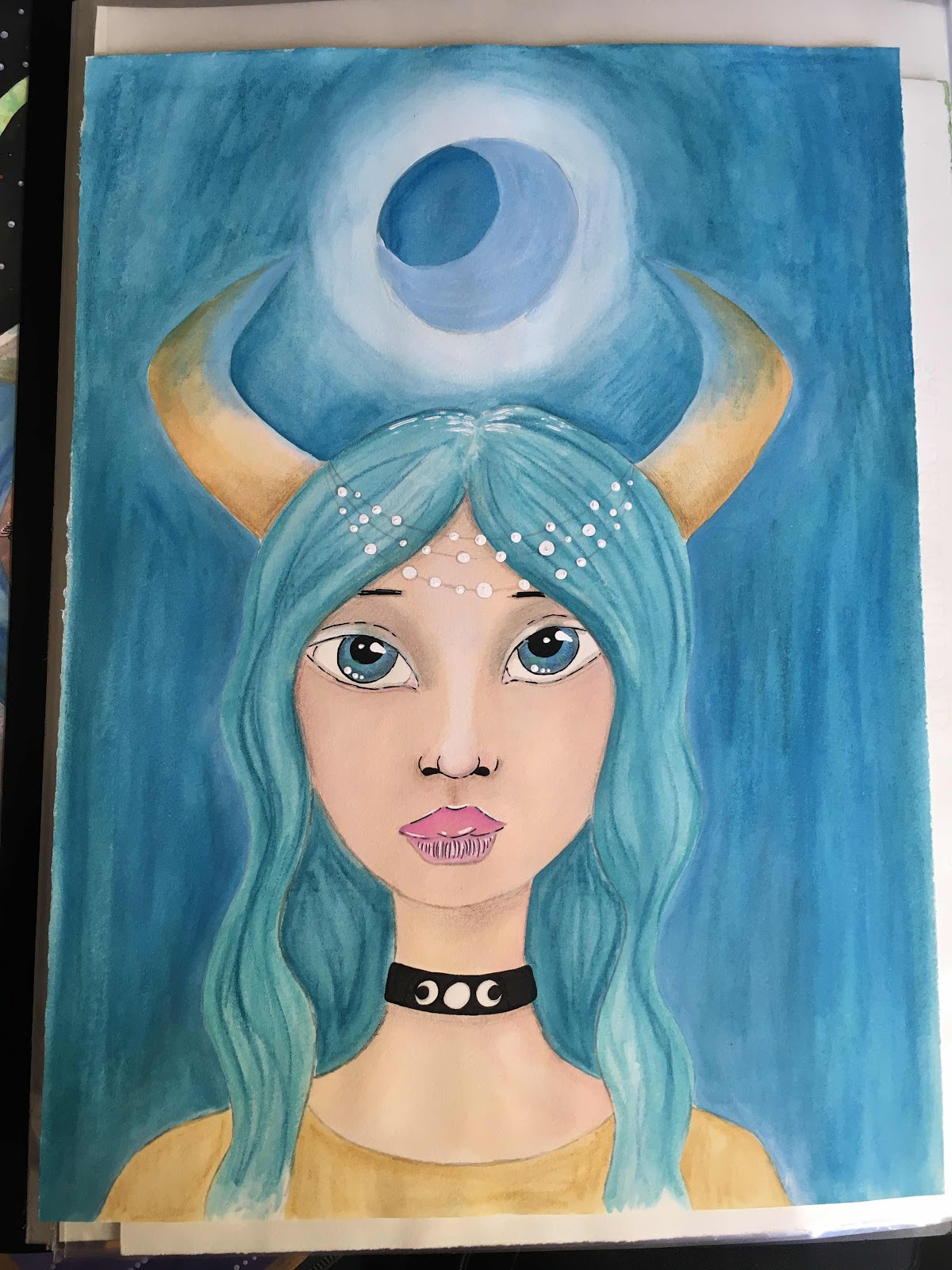
Eyes too large, moon not shiny enough, horns all the wrong colour! I hated every bit of her.
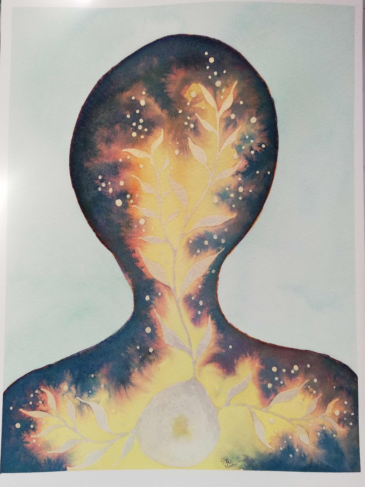
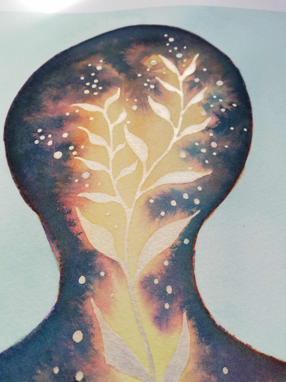
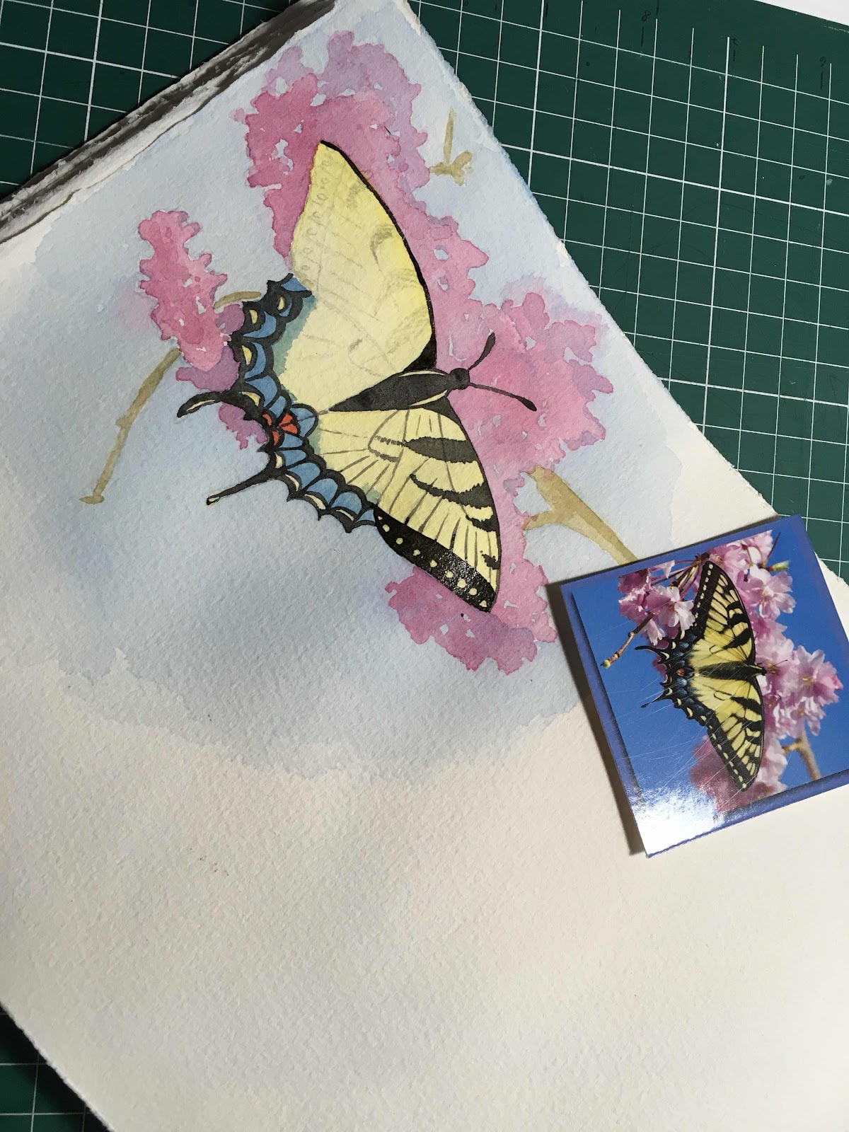
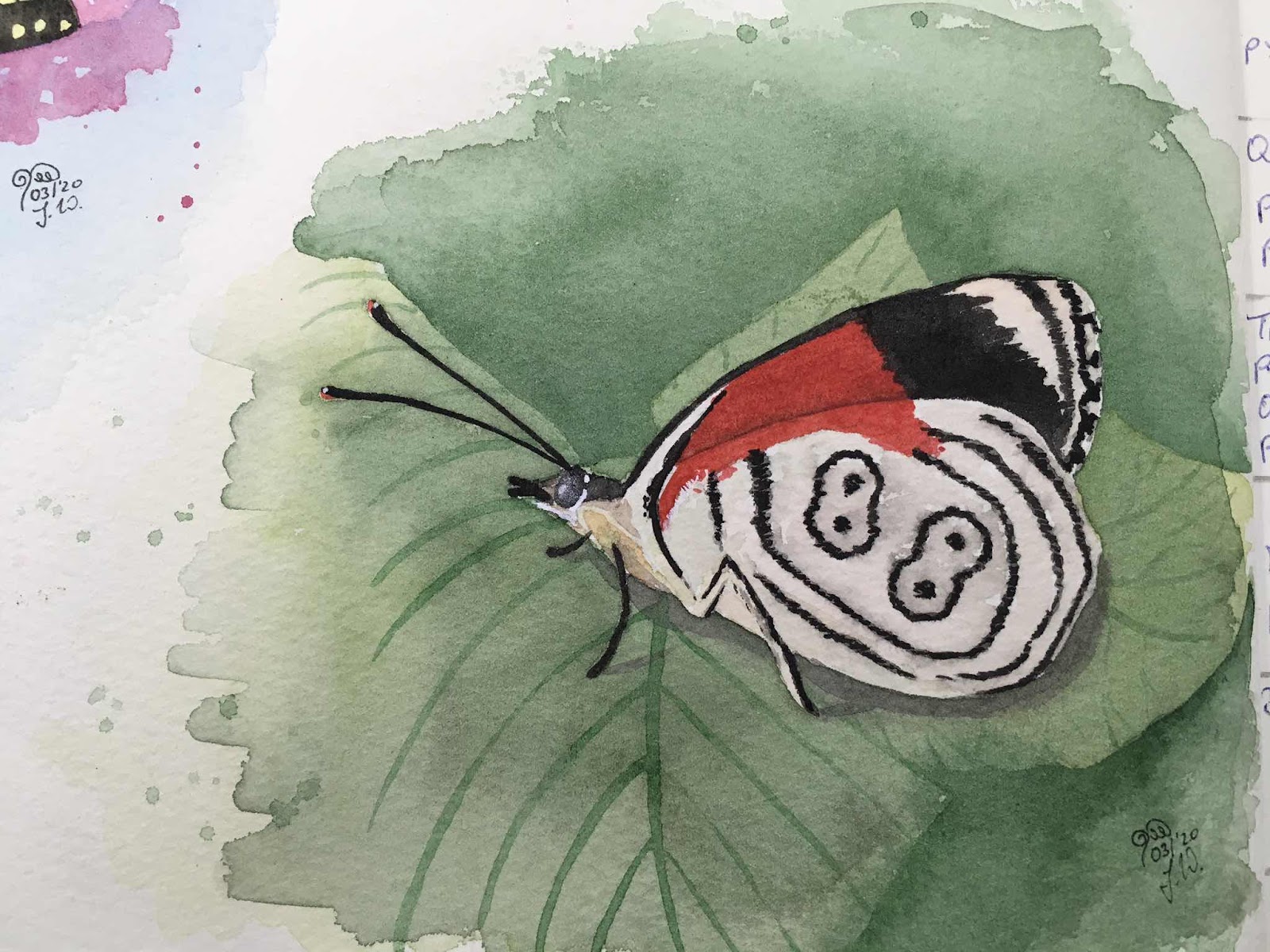
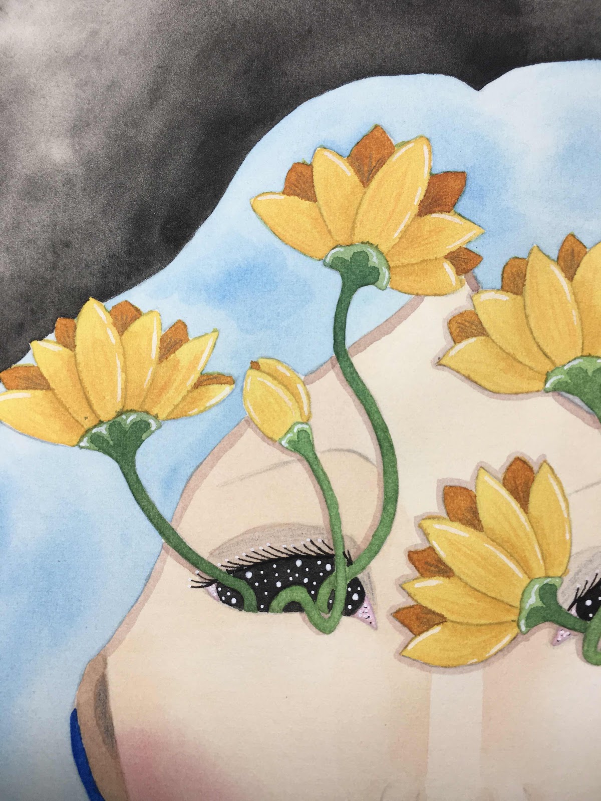
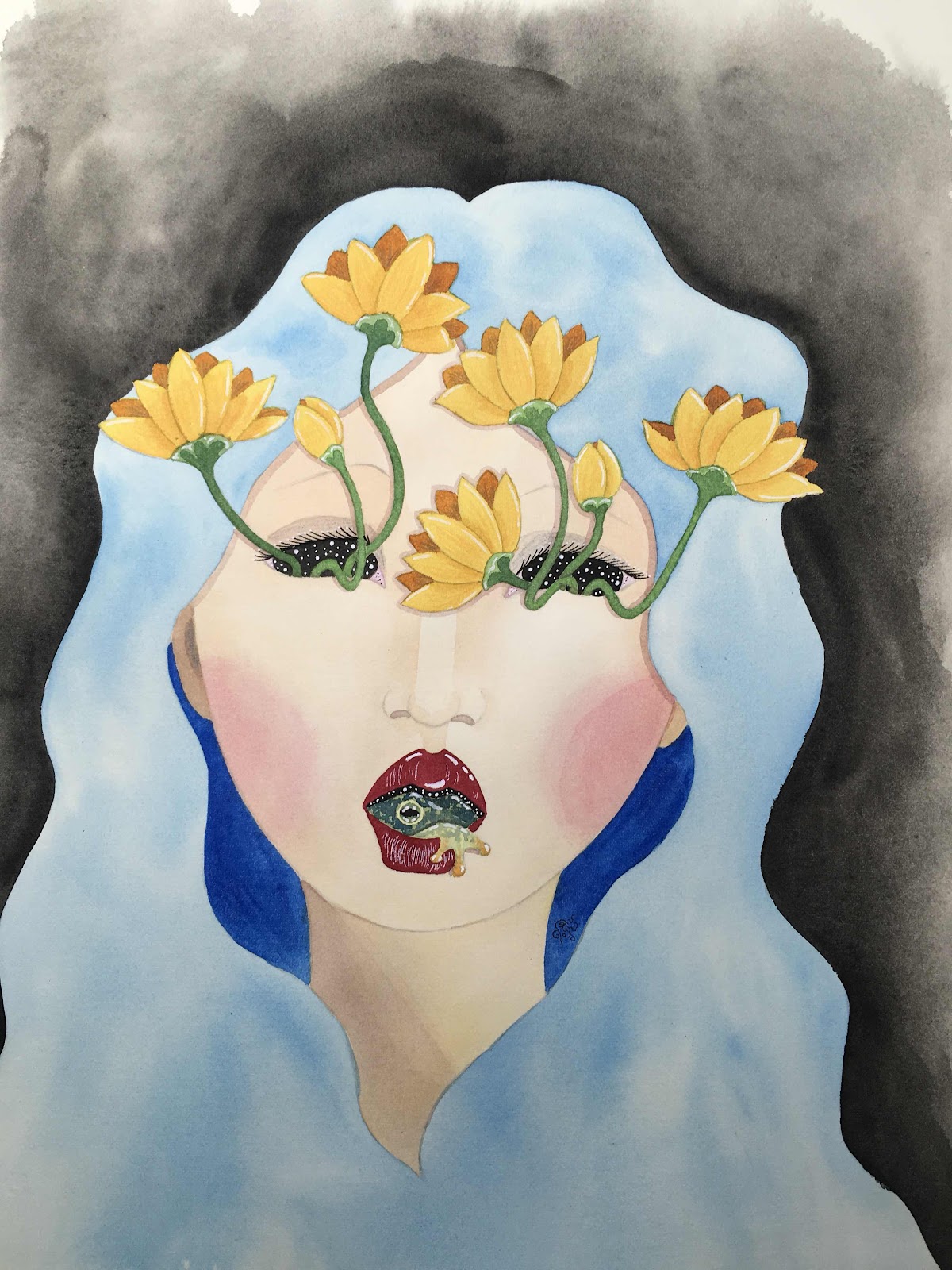
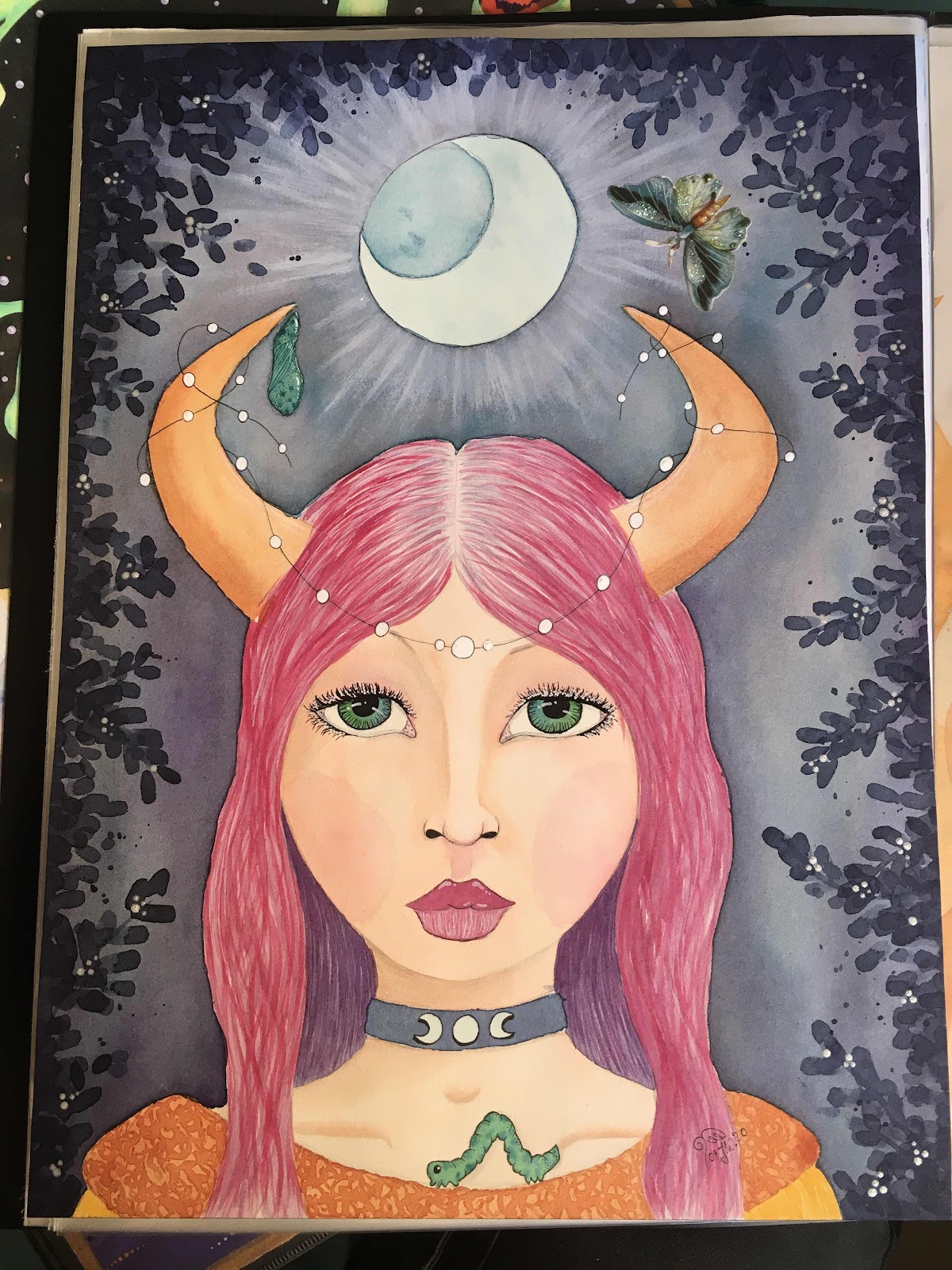
It took me until September 2020 to sit down and start her again, this time in watercolour, a medium I really favour these days, and with a slightly different colour scheme. I used white acrylic paint to enhance the moon and for the first time in a long while I also used pearlescent medium for extra shimmer. Then I added the butterfly lifecycle to symbolise transformation and finally collaged on a matching paper butterfly. I also got inspired by a lesson by Willowing.org and added the dark leaf border.
I love this lady much more than the first version, she is much better balanced and worked out, the watercolours were much easier for me to work with. And I am keeping the first version as a reminder that sometimes a painting doesn’t work out just because I want it to ;)


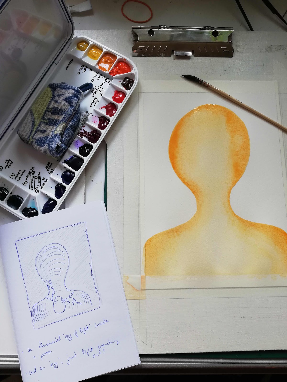
The next painting has a similar process story, but much much earlier beginnings. It started off with making pancakes with my kids and noticing the strange shapes on the pancake...


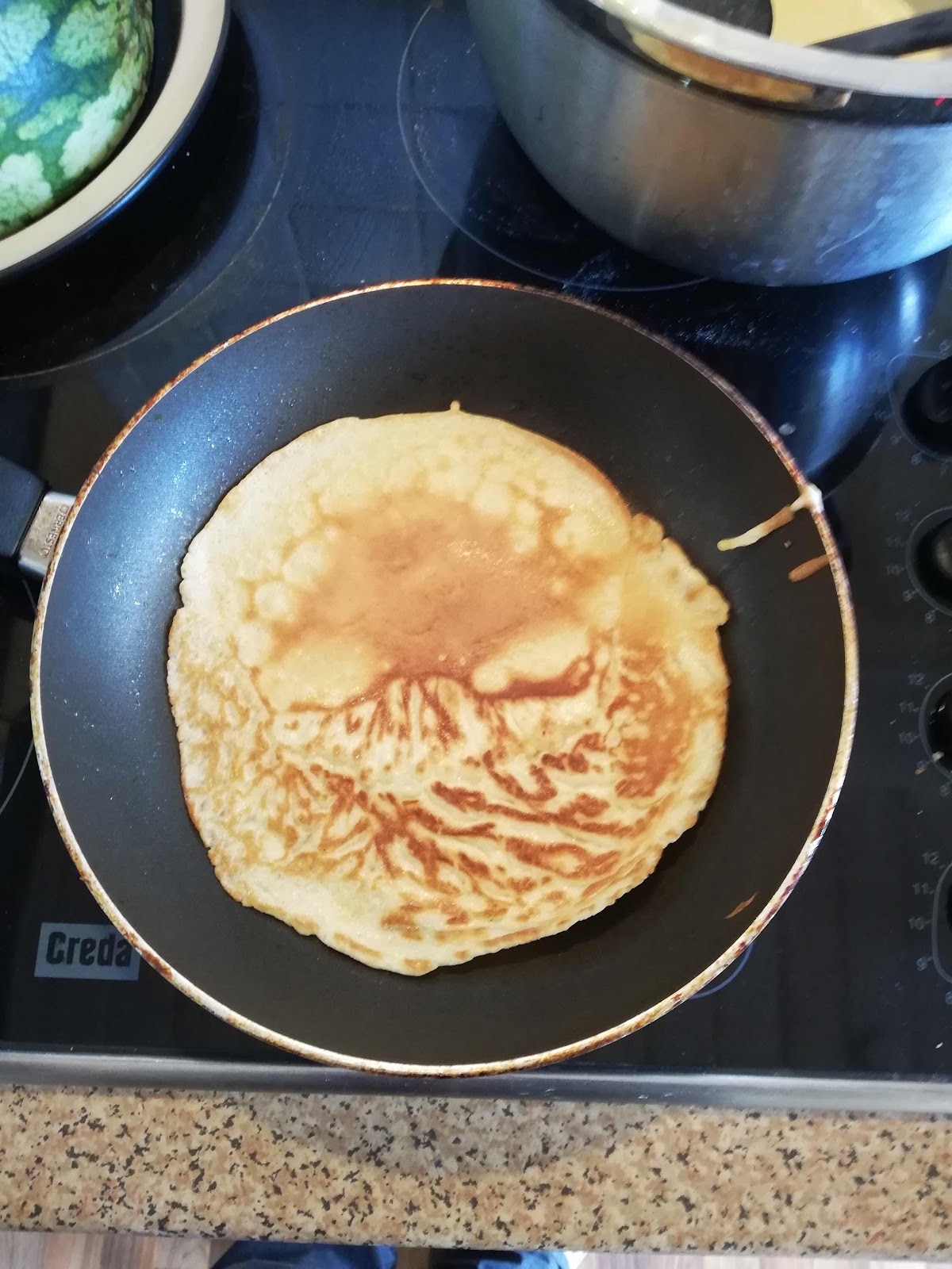
I was very much reminded of a skull, and I just knew I would be able to use it to show the influence of the ego on us. I did do some colour studies first in a way...


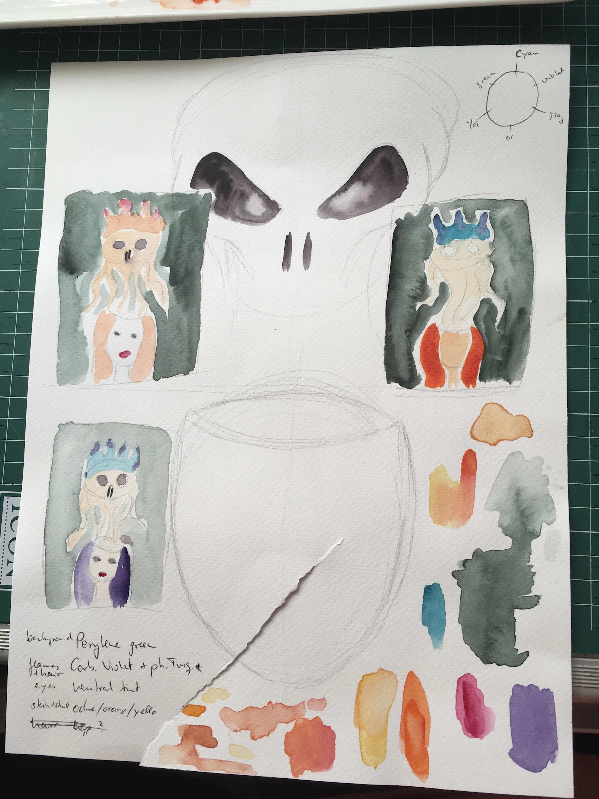
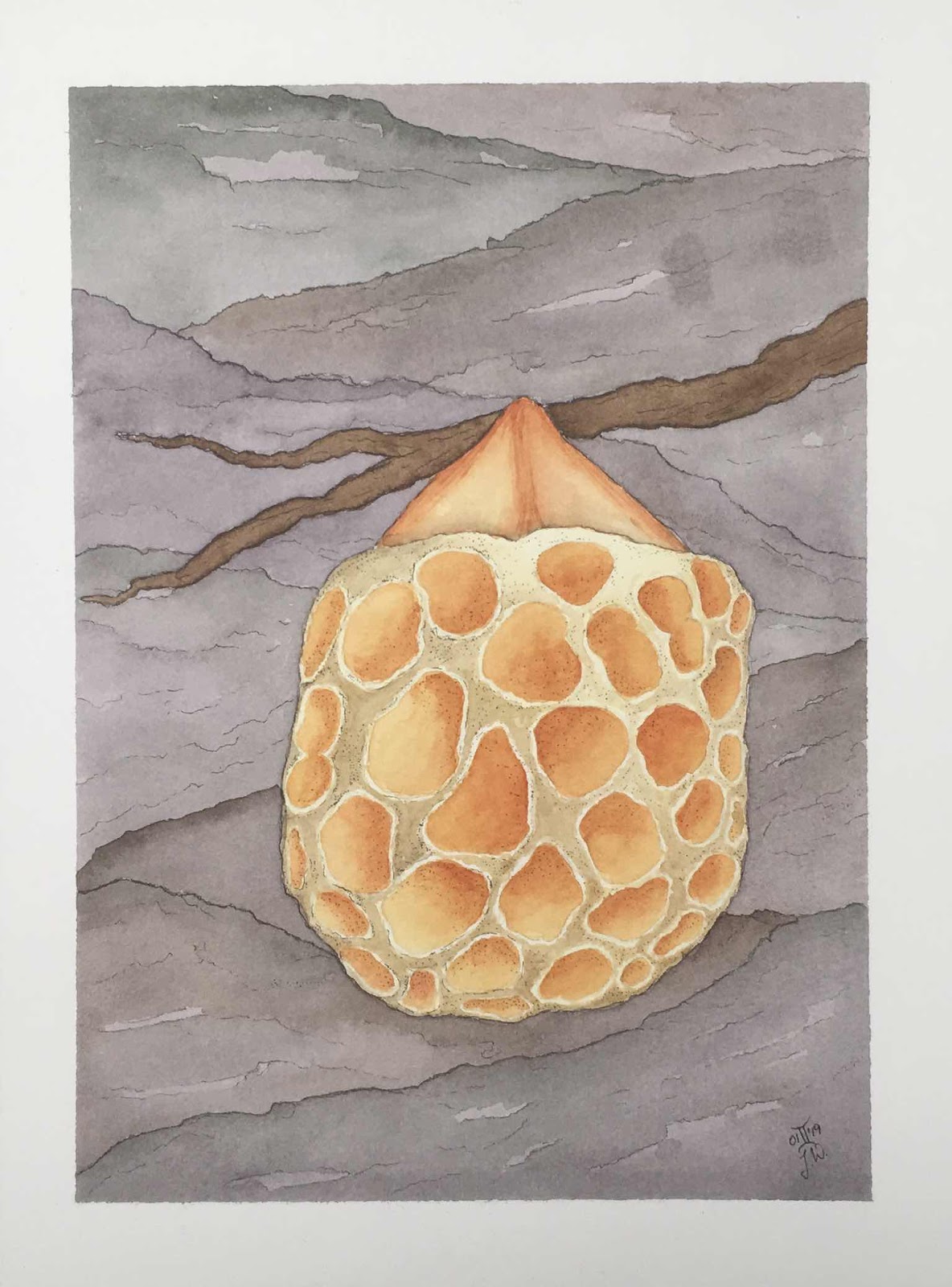
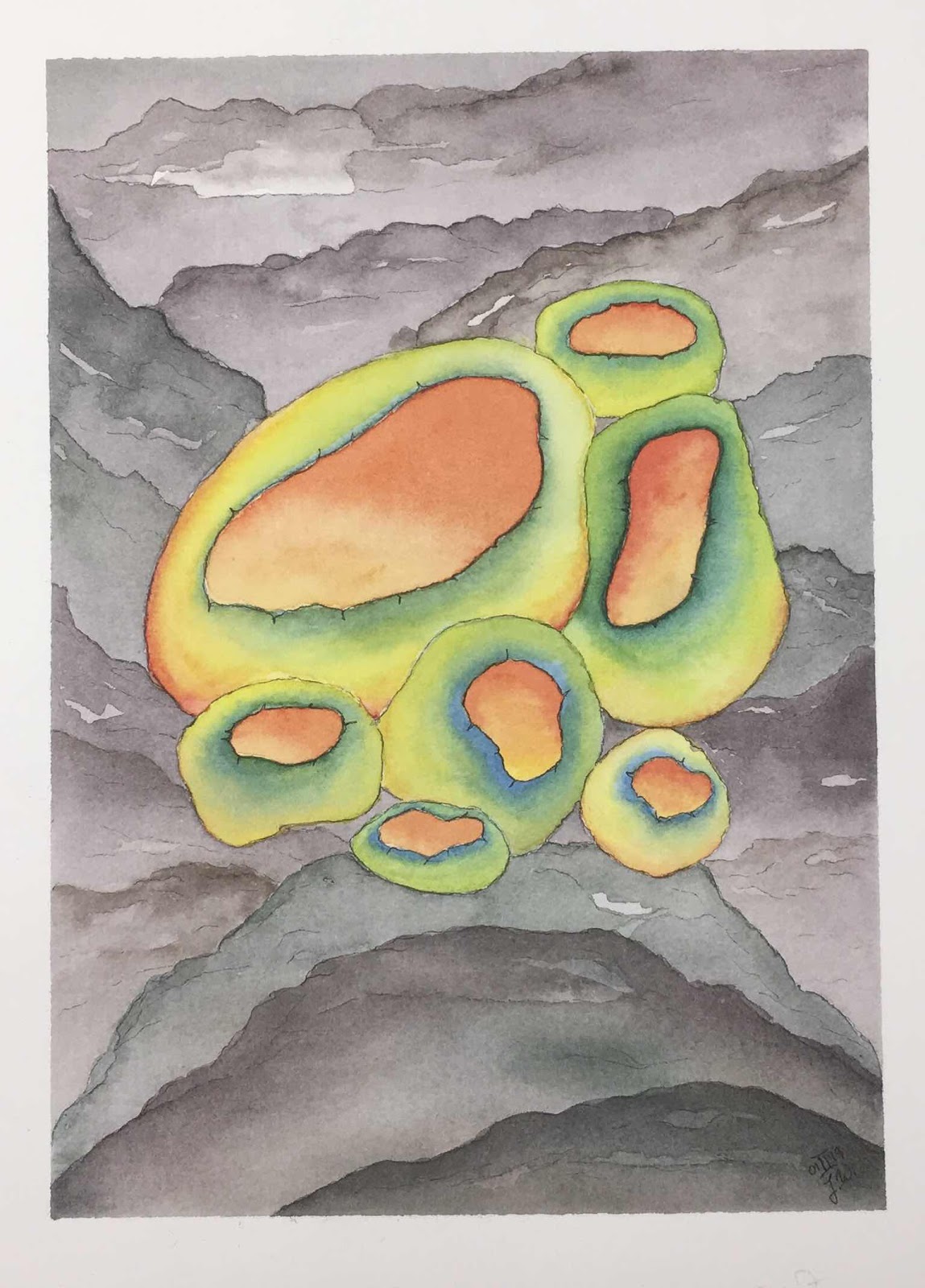
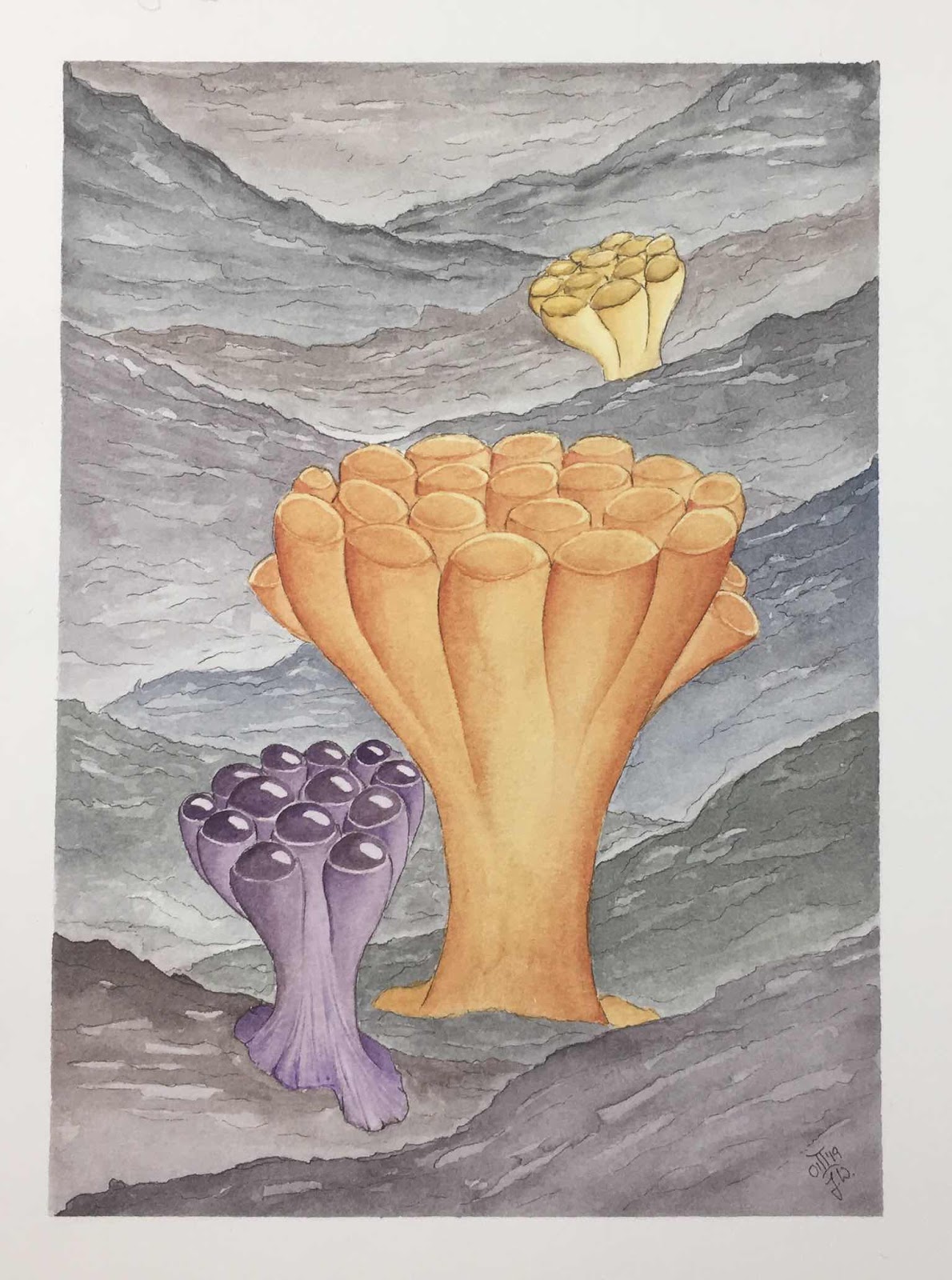
But when I started the actual painting I got very unsure about what paints and colours I wanted to use and even what I wanted to do for the background. I thought I would go for the inside of a carnivorous plant that lures its prey inside and then the victim cannot find its way out because the structure of the plant mimicks openings except for where the real exit is (underneath).


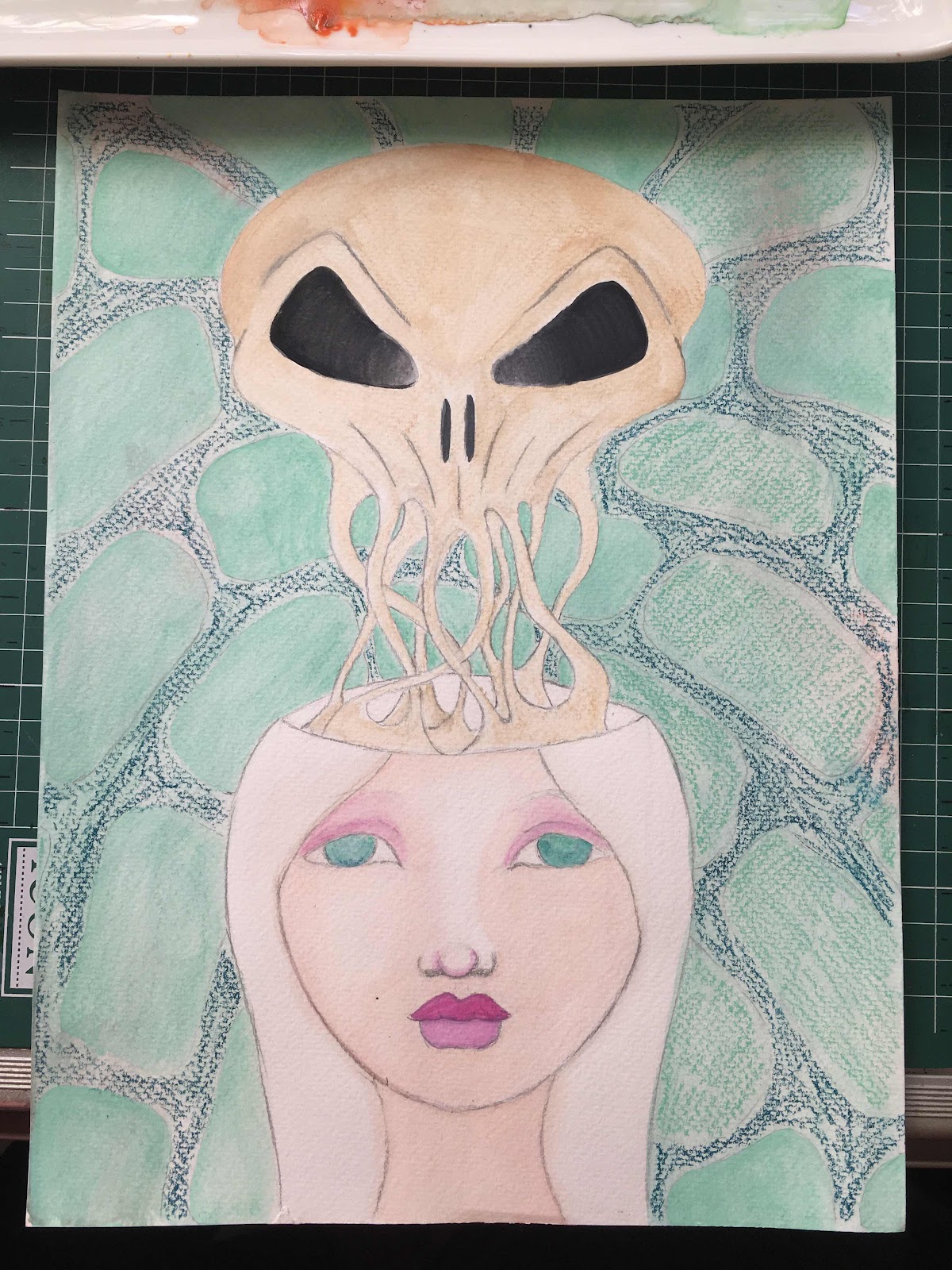
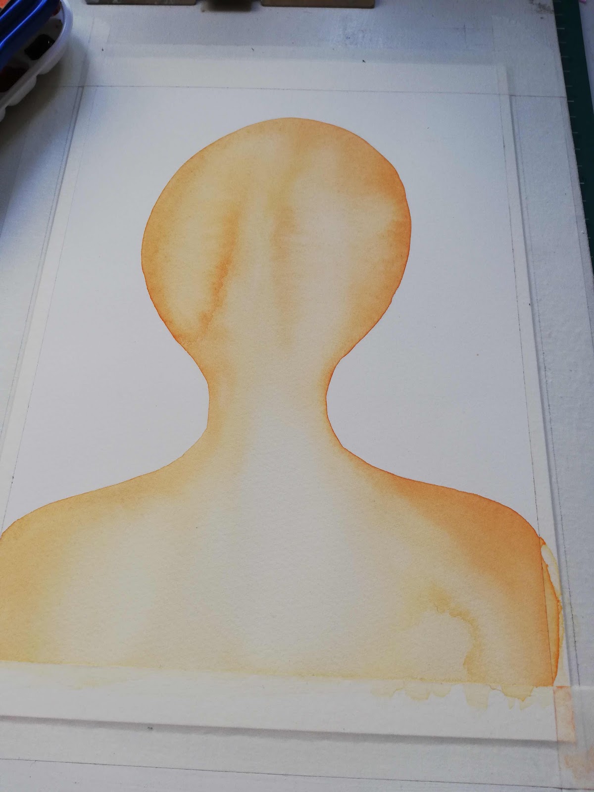
As you can see I did not even finish the first try. I used the watersoluble crayons and acrylics again and all I wanted to do was use watercolours instead. And different colours and a different background, basically nearly a different everything. It was really hard to get as far as I got the first time around, at least the paper I used wasn’t much bigger than A4.
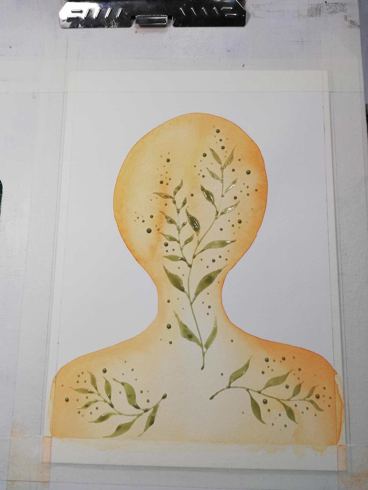
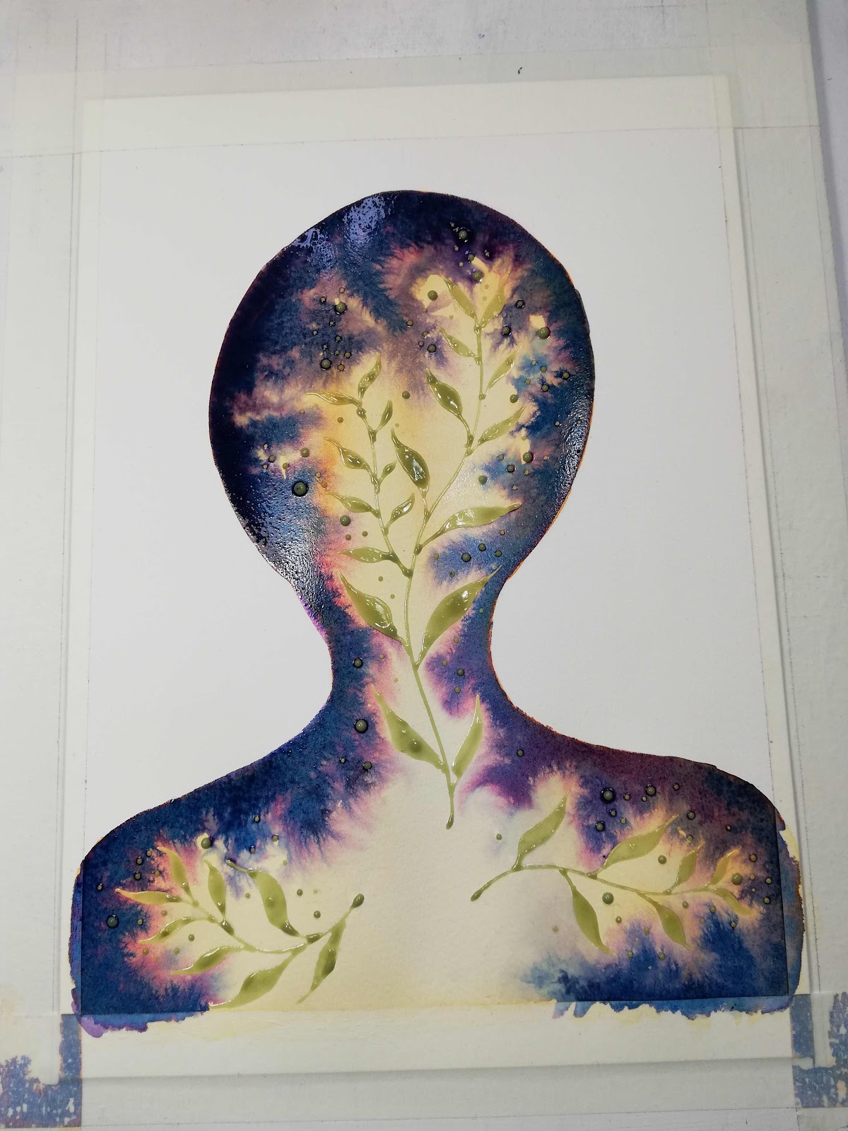
A couple of weeks later I tried it again, actually exactly after I had finished the Taurus girl painting. I had talked about it with one of my sons who mentioned that flames would probably be cool somewhere in the painting and from there the whole thing really took off...


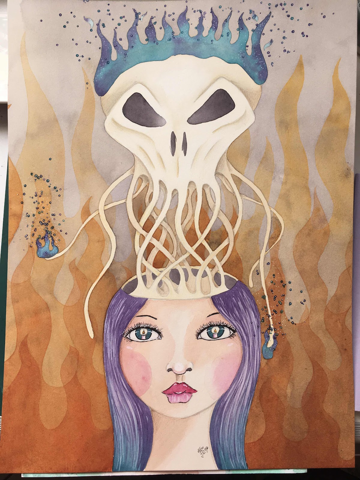
This last piece was done on a much larger paper than the first try, and I really love how she turned out. Even if her ego is trying to drive her bananas, the candle in her eyes shows she knows all she has to do is listen to the calm inside.
Sometimes it is worth it to listen to your kids ;)
And push through the inner critic.

Saturday 10 October 2020

Seeking Connection


All humans seek connection. Some need connection more, while others are quite content with less, but we all need connection in some way, shape or form.
How do we fulfill our need for connection today? How do we form meaningful connection with other humans in times where we are not allowed to meet in person, or where it is not advised to meet in person? How can we connect meaningfully in a world of fake news and fleeting online and social media acknowledgement? How can we share intimacy with friends and family within the public space of facebook etc?

What or who do we seek connection with? 

Sometimes, when external connections are not an option for one reason or another, we can take a step back and seek the connection with ourselves. Who am I? What are my values, principles and priorities? What is actually neccessary in my life and what can be put on hold or even let go of? What is it that I really need, what is it that my life really is all about?
This connection with ourselves is often neglected or even frowned upon by society as selfish. But a lot of the time it is very much neccessary to evaluate ones goals and boundaries and connections for our very own self care.
We have a tendency to be almost exclusively in our heads, engrossed in a world of thinking and intellectual noise. But where is our body at? Who feels their own body, is in connection with their own body at any point during the day? Sure, we all have a body and when we stub a toe it hurts, so what am I on about? But who can feel the aliveness inside their own body? Who, in todays world, is actually able to have a true connection between their own mind and their body?
For true connection with ourselves we need to be in tune with both, our minds and our bodies. And if our minds take on a life of their own, if we experience anxiety and fear and perceive madness, it is often our bodies that can act as an anchor and keep us from loosing ourselves within our labyrinth of thoughts.

I have always found the legend of Castor and Pollux to be a very beautiful one. Twin brothers, one celestial and immortal (the spirit) and one earthly and mortal (the body). Both loving one another so intensely that when Castor was killed in battle, his brother was so stricken with grief that the gods took mercy and reconnected them as the celestial starsign we know as Gemini.


Sunday 10 May 2020

The Light Is Already Within


This is part two of my previous post about Qor Watercolours, this painting makes creative use of the extensive feathering effect that some of the Qor watercolours exhibit. 

I left the first rough idea and sketch next to the first phase of the painting so you could see how most of my art happens. It usually starts with a very simple idea sketch with just a handful of basic notes of where I want the piece to go. I do this in case I do not get the time to make a finished piece immediately; with so many kids in the house and under a stay at home order I do not get much art time and notes help me reconnect with the idea at a later stage.
I had the idea of an egg of light in the centre, however I decided against it because I realised that I had read about this Egg of Light in a book I had read a couple of months ago and I did not want to copy this imagery.

Here you can see the first base layer, made with a mix of high flowing Qor and non-spreading Holbein Watercolours.


This is what it looked like after it has dried. My goal was just a rough gradient from light to darker as you move away from the centre.


I then added masking fluid with a mylar cone, I use this way of applying the fluid because it is the easiest way to prevent and deal with clogged tips.


This was my favourite stage of the painting: working very wet and watching the feathering unfold. I used Qor Phthalo Blue and also a mix of reds I had on my mixing palette to convey a bit of a galaxy effect.


Now I had to add another creamy layer so that the masked off leaf design would stand out afterwards. And to be honest, this is where I started to go wrong in a way...


As you can see I ended up with an egg shape after all. Now I could not resist the urge to add something shimmery, after all, it is supposed to be leaves of light. And I ended up with...


An egg! Quite obviously I really wanted to make an egg shape, as in my original planning stage for the painting. I do actually like how the shimmery leaves came out and I love the feathery blue effects.

What is this painting all about, though? It is about finding The Light Within, the Hope, the piece of Spirit, the Soul that I believe is in every living being. The book I have referred and linked to above is a very good description of the journey to discover this piece of Light Within. 
This painting really symbolises that the Light is already inside. It is not (and never was) outside of us and because it is a part of us we can actually find access to it. It is not unobtainable but right here, within (!) our reach. That to me is a very comforting thought and realisation. 


Wednesday 29 April 2020

Qor Watercolours

Today is going to be an introduction to Qor watercolours. This is not an official review, nor is it sponsored by Qor. I had heard a lot about these paints, especially about their tendency to spread madly when placed on wet paper and eventually I was not able to contain my curiosity any longer. I think I start to become a watercolour collector of sorts :)

Qor has a couple of introductory sets that they sell, one of them is actually called Introductory set and in theory it contains the basic colours needed for colour mixing. It comes with Hansa Yellow Light, Pyrrole Red Light, Permanent Alizarin Crimson, Phthalo Blue (green shade), Ultramarine Blue and Burnt Sienna Neutral. Whenever I get new watercolours I just love to paint some swatches to see how they mix with each other. This is also a great exercise to keep you arting through artists block when you are just plain out of ideas or inspiration.


As you can see the colours in this set mix lovely neutral and muted tones. I love all colours, but my favourites are bright and vibrant colours so this set as a standalone would not work for me in a painting. But I also wanted to see this mad flowing capability that I had heard of and so I prepared some wet sample squares in my sketchbook and tried out each colour on its own:


And for me THIS is awesome!!! The feathery fingers in the blues and the Pyrrole Red Light are fabulous and I know I will be getting some awesome use out of this crazy dispersion pattern! 
The only thing I was not happy about was the muted neutral colours I could mix with this set, so I went ahead and got myself a second set because it was on offer at Jacksons art supplies. This time I got the High Chroma set and this one has basically all my favourite colours in it:
Cobalt Teal, Green Gold, Quinacridone Gold, Transparent Pyrrole Orange, Quinacridone Magenta and Dioxazine Purple.
Here is the High Chroma set swatch sheet:


I did not anticipate a huge range of vibrant colours that could be mixed with these as the colour selection appears to be rather random, but I got some nice and vibrant oranges and rich yellows out of this.
The dispersion test did not disappoint either, but this time there was no crazy feathering as I got out of the Phthalo Blue and the Ultramarine Blue before.


For me now the next logical step was to combine the two sets into one and swatch them all out together. 


I find that I do prefer non-granulating colours, so even though I love the Teal I only use it sparingly because it granulates. And the same goes for Ultramarine blues and violets, I know they are so important for mixing but I just find it hard to befriend the granulation in my paintings. But what happens in the mixing wells with granulating paints is beautiful and magical. When the pigments separate you can see some awesome effects.


This is the final big swatch sheet with all the 12 colours, it has vibrants and neutrals and muteds. I had expected really strong colours for some reason but I do like the overall softness in all the shades. And I do love the pigment separation that happens with some of the Cobalt Teal mixes, they really need the right subject matter to be put to good use.


These paints are beautiful, on their own and in mixes. They are expensive though and I more than likely will not replenish my stash once the colours get used up. An exception might be the Phthalo Blue simply because the awesomely crazy dispersion, I think I will be holding on to that one ;) 

Next post I will show the process of a painting utilising the feathery finger effect.


Saturday 18 April 2020

Catching Up and Lockdown Art


Soo much is happening these days, unfortunately most things that I currently spend my time on are not art related. But I do get the odd moment here and there and since I also have a couple of older projects to publish I might as well give it a go now ;-)


Let‘s start with papers and journals. I have a love-hate relationship with my normal art journal, the one where I paint a lot of my heads into. I keep thinking that every piece I paint in it must be a „perfect“ piece. So not much is happening in it most of the time, and I do not really have a safe space where I can just learn new techniques, or practise drawings or concepts or just do swatches. I love doing paint swatches, whenever I have artist block I can still get my paints out and swatch something.
So I decided to make a journal that is quickly and simply bound, no hard covers, not too expensive paper but also not crappy paper. I went ahead and ordered some large sheets of Waterford & Saunders paper in hot press and also in cold press. I have used the hot press paper before and I love it, but in this stress free journal I also wanted to give myself permission to experiment with different paper textures and I have to say I absolutely love (!) the feel of the cold press paper. It is beautiful to work with and by now I kind of prefer it over the hot press to be honest...

But anyway, I wanted to use the full sheets, and make the journal as simple as possible, so I just tore the paper into strips and folded those in half. The next picture shows some of the torn strips and my cat „helping“.


Here I have already stitched up one of the strip sets, the amount of paper sheets I tore gave me two decently thick journals with 8 folios each. They are in landscape format for a change (so far I only used portrait) and I ended up giving one of the resulting sketchbooks to a friend.


The next picture is a class I saw on youTube by Clarice Gomez , I admire her loose style and I feel drawn to cherry blossoms every spring...


And now we are starting to enter Lockdown territory, all the following pieces are made during the last 4 to 5 weeks, whenever I could steel a minute or two. I was watching a lot of meditative and stress free painting vids by Coco Bee Art, and I thought I could try that in my stress free journal, just explore some watercolour splashing about. I let the splashes and swooshes dry and then I saw a rooster in there. I tried to bring him out a bit more without loosing the loose feel he has to him. This, to me, was a very difficult exercise, and I am not sure about the result at all. I really feel a lot safer in my painting when I have a clear idea and preliminary layout in my head or on printer paper, always best clearcut and with outlines and straightforward boundaries. But that is exactly what this journal is supposed to be for, to allow me a space to be uncomfortable.


Then I tried my hand at some butterflies I had cut out of an old calender. The original photographers were not named so unfortunately I cannot credit them. The goal was again to paint as loosely as possible without straying too far from the picture. Realism was not a priority though.


I enjoyed painting both the butterflies and I am very happy with how they turned out.
At this point I feel it is important to maybe show a random page from this journal, a page where I really did just try out this and that with no proper purpose behind most of it, and no care about how it would look.
This first picture is just a swatching of the combination Carbazole Violet/ Phthalo Turquoise. I love the beautiful shades these can create together. And also a trial of simple tiny flower petals and a Mary Doodles inspired ghost.


Then a blob monster, some more butterflies and a random flower my daughter wanted me to paint. As you can see I did not even care which side of my journal is up.


Now to my most recent work, another head.


The plan was to use all watercolours for this one, and to not trace any outlines with marker. You can still see outlines in the end, but they are from the original pencil drawing I conveniently never bothered to tone down to near invisible ;-)


I loved the way the watery hair had turned out, I wanted to just leave it like it was...


I got the idea with the flowers coming out of the eyes from a drawing my daughter made. She wanted to make a silly face, but then the flowers coming out the eyeballs creeped her out a little and she erased them. She does like the golden lotus blossoms though.


One phrase that kept going through my mind while painting and drawing this was “No mud, no Lotus” which basically means that without the hardship and dirt of the mud the beauty of the flawless flower could not exist. And every time we go through hardships and struggles these experiences change and shape us, make us who we are and ultimately (hopefully) more beautiful and strong. I used the frog as a symbol for transformation, a being starting out in the water (emotion) and after his transformation being at home in both water and air (emotion and mind)


I wanted to call her finished, but she still looked a little plain. I did not want to change her watery hair too much but she needed a little more texture and movement and also a little something at the bottom.


In the end I used mostly watercolours, some coloured pencils and also some acrylic paints. She is painted on a single sheet of Waterford & Saunders Hot Press paper, about A3 size. I really like how she turned out, hopefully I managed to navigate the narrow path between creepy and pretty. All our struggles may be scary for us, but I also want to portray them as a potential for great and needed and potentially beautiful change...


Wednesday 5 February 2020

„Headestals“ Art Exhibition


This year started of with great excitement for me: I had my first solo art exhibition. 
Some time during the last year a friend of mine in an art group asked me a very important question, and I think the most important bit about it was how she phrased it.
 She asked me : “Well, Jessica. Wouldn’t you have enough paintings by now for your own exhibition?”
Just a few words, but because she had asked so broadly I actually started thinking about it and counting the pieces I had painted over the last few years. I counted over twenty. And if that isn’t enough for a small solo exhibition, I don’t know what is. It still wasn’t an easy task for me, I had battled limiting self-talk and self-depreciating thought processes for quite some time and mustering up the courage to even ask the location took me a couple of weeks. The only condition that the venue put on me was to work the exhibition around an event if possible, to give it a theme so to speak. I did not want to choose Irelands mental health week in October because I did not want to take it away from the local mental health groups that usually exhibit there during that time so I picked the first two weeks of the next year to align myself with the First Fortnight Festival that highlights mental health and artists.
Now I am very glad it worked out this way, I would not have been mentally ready or even distanced enough from my art pieces to exhibit in autumn. But something shifted during the month of December, and I was able to really appreciate the work I had done over the last years and acknowledge the journey I had undertaken. I was ready now.

First I would like to share the flyer I made with the substantial help of my 12yr old son. He can use the program I needed to edit the flyer so much better than me... (this years to do list: learn how to use photoshop or equivalent)


My son also gave me a hand in typing out all the descriptions I wanted to place underneath each picture. I am not fond of art that induces questions but explains nothing. Some of the paintings I have already posted about here in the past.


At first I wasn’t sure in which order to place the artwork, and then decided to stick with the timing of them, in order of their making. Because each piece tells a different story and marks a different point in my personal development.


I made all of the pieces available for sale except these three. They are by far my favourites and most important to me. I wanted to have prints of them ready, but they were too large for the local printers scanner and I ran out of time to take proper photographs of them myself. So I decided to keep them a while longer... (to do list: learn how to operate the husbands mighty camera so I can take proper pictures of my own artwork...)


As wide an image as my phone would allow. I have another image that includes all the pieces... and a small boy that ran into the shot and that I couldn’t edit out...


All in all my first exhibition went really well I think. I had 15 paintings hung and over twenty people attending the official opening, not counting assorted children, and some of them had only returned home from abroad that same day. I sold 2 paintings and a lot of people bought prints of the works that I had, and I got my exhibition extended by another week as well. Plenty of visitors left lovely and open comments in the visitors book, I love reading them.

So now I can move on to another project that needs finishing up and that is already 3-4 years in the making. I will definitely post about it here once I am finished with that one and ready to go public ;-)

Wednesday 1 January 2020

Mushroom Painting Series part 2


What could be a better blogpost in the New Year than to complement and complete a series, so today I am posting the conclusion to my watercolour mushroom series. All paintings are 5“ x 7“, painted with Winsor/Newton professional and Schmincke watercolours on Arches HP 300gsm watercolour paper. I will provide all the information about each fungus to the best of my knowledge, but please, do not (!) take my word for anything without doing your own research. I chose to paint all these particular fungi simply because of the beautiful or odd way they looked, not because they are personal 
friends of mine ;)
DISCLAIMER: I am NOT a mushroom expert, NEVER consume any mushrooms you find in the wild unless either you are accompanied by a mushroom professional or you are a mushroom professional yourself!


I will start off today with the first Mushroom I painted for this series.
Cyttaria Gunnii


This one was one of my favourites to paint.
Crucibulum Laeve, commonly known as Birds Nest Fungus.


And another beauty:
Ramaria Apiculata, listens to the common name Green Tipped Coral Fungus.


I could not believe my eyes when I found pictures of this one, it can be very colourful.
Caloscypha Fulgens


We are probably all familiar with the next one, it is poisonous and should not be consumed.
Amanitha Muscaria, the Fly Toadstool.


Of the next one I found many different pictures and for a little while I was confused as to how it actually looked. Then I found out that it can change its colour and appearance as it ripens and I decided to paint all its stages into one painting.

Metatrichia Vesparium, the Wasps Nest Fungus. It resembles a wasps nest more and more the older and dryer it gets.


And last one for today is a fungus native to Ireland.
Psilocybe Cyanescens, also known as Wavy Caps. As the name suggests this one has psychotropic properties and it also contains a blue dye that makes its stem turn bluish when it is bruised or cut.