Soo much is happening these days, unfortunately most things that I currently spend my time on are not art related. But I do get the odd moment here and there and since I also have a couple of older projects to publish I might as well give it a go now ;-)
Let‘s start with papers and journals. I have a love-hate relationship with my normal art journal, the one where I paint a lot of my heads into. I keep thinking that every piece I paint in it must be a „perfect“ piece. So not much is happening in it most of the time, and I do not really have a safe space where I can just learn new techniques, or practise drawings or concepts or just do swatches. I love doing paint swatches, whenever I have artist block I can still get my paints out and swatch something.
So I decided to make a journal that is quickly and simply bound, no hard covers, not too expensive paper but also not crappy paper. I went ahead and ordered some large sheets of Waterford & Saunders paper in hot press and also in cold press. I have used the hot press paper before and I love it, but in this stress free journal I also wanted to give myself permission to experiment with different paper textures and I have to say I absolutely love (!) the feel of the cold press paper. It is beautiful to work with and by now I kind of prefer it over the hot press to be honest...
But anyway, I wanted to use the full sheets, and make the journal as simple as possible, so I just tore the paper into strips and folded those in half. The next picture shows some of the torn strips and my cat „helping“.
Here I have already stitched up one of the strip sets, the amount of paper sheets I tore gave me two decently thick journals with 8 folios each. They are in landscape format for a change (so far I only used portrait) and I ended up giving one of the resulting sketchbooks to a friend.

The next picture is a class I saw on youTube by Clarice Gomez , I admire her loose style and I feel drawn to cherry blossoms every spring...

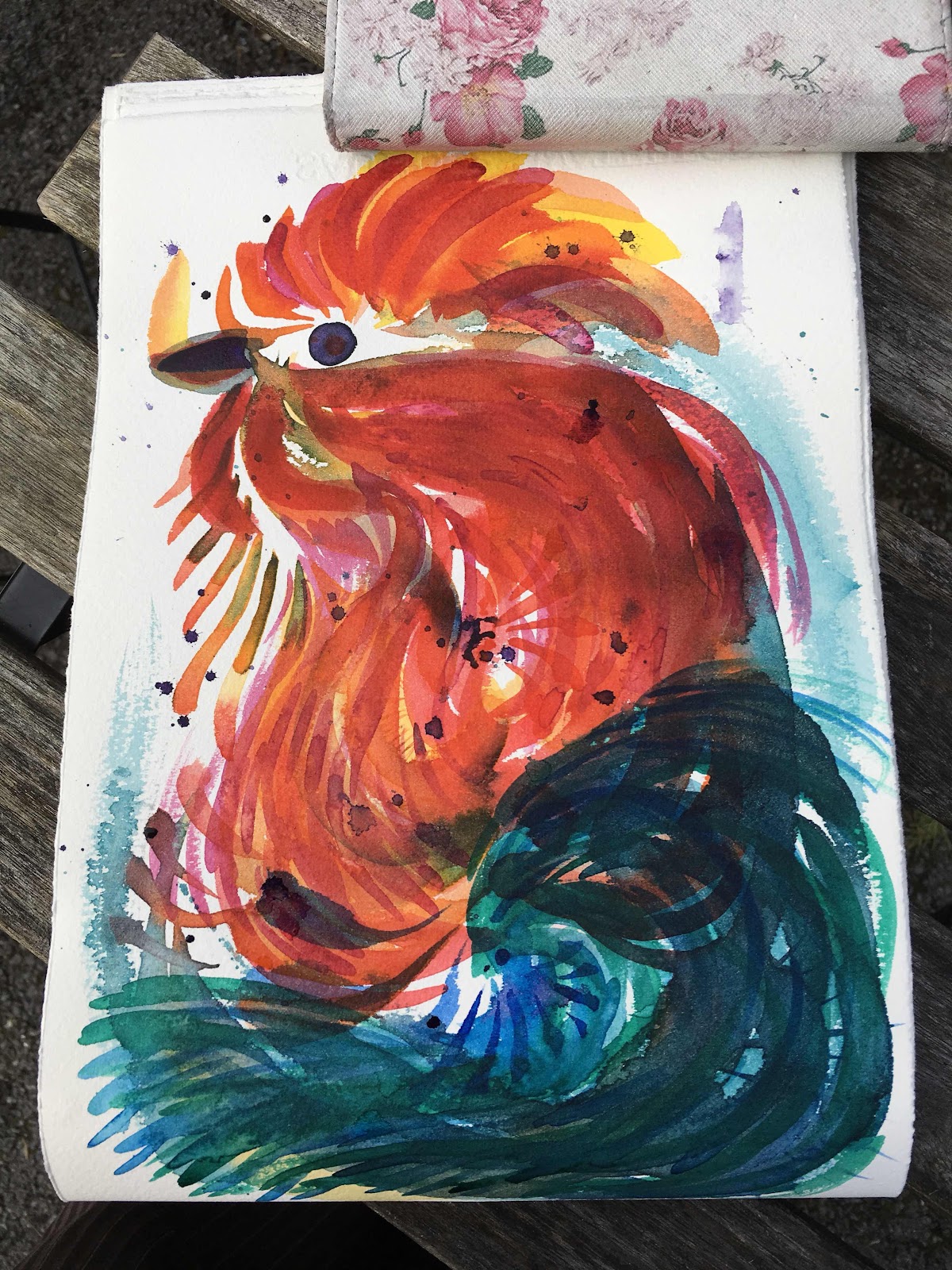
And now we are starting to enter Lockdown territory, all the following pieces are made during the last 4 to 5 weeks, whenever I could steel a minute or two. I was watching a lot of meditative and stress free painting vids by Coco Bee Art, and I thought I could try that in my stress free journal, just explore some watercolour splashing about. I let the splashes and swooshes dry and then I saw a rooster in there. I tried to bring him out a bit more without loosing the loose feel he has to him. This, to me, was a very difficult exercise, and I am not sure about the result at all. I really feel a lot safer in my painting when I have a clear idea and preliminary layout in my head or on printer paper, always best clearcut and with outlines and straightforward boundaries. But that is exactly what this journal is supposed to be for, to allow me a space to be uncomfortable.

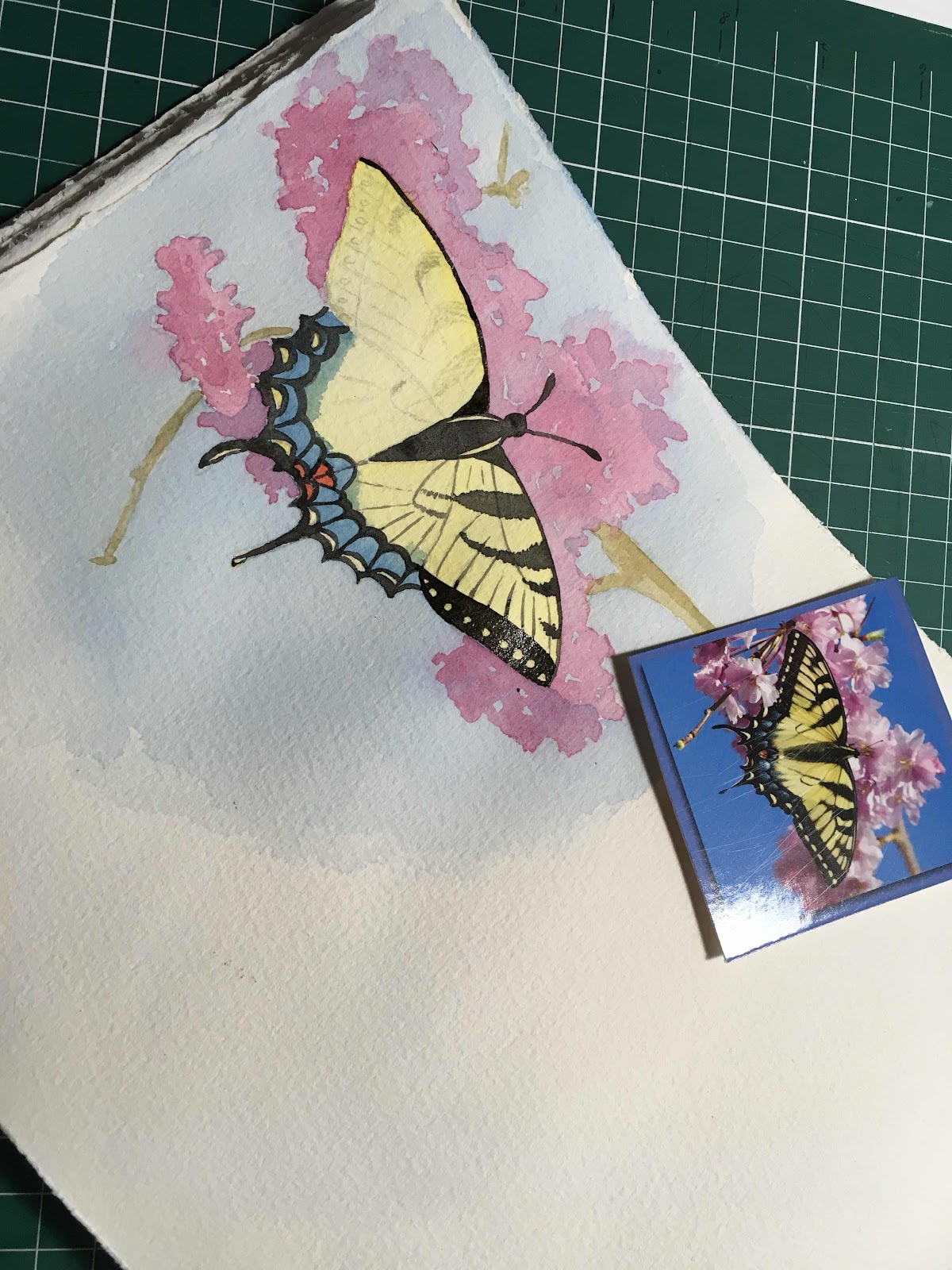
Then I tried my hand at some butterflies I had cut out of an old calender. The original photographers were not named so unfortunately I cannot credit them. The goal was again to paint as loosely as possible without straying too far from the picture. Realism was not a priority though.

I enjoyed painting both the butterflies and I am very happy with how they turned out.
At this point I feel it is important to maybe show a random page from this journal, a page where I really did just try out this and that with no proper purpose behind most of it, and no care about how it would look.
This first picture is just a swatching of the combination Carbazole Violet/ Phthalo Turquoise. I love the beautiful shades these can create together. And also a trial of simple tiny flower petals and a Mary Doodles inspired ghost.
Then a blob monster, some more butterflies and a random flower my daughter wanted me to paint. As you can see I did not even care which side of my journal is up.

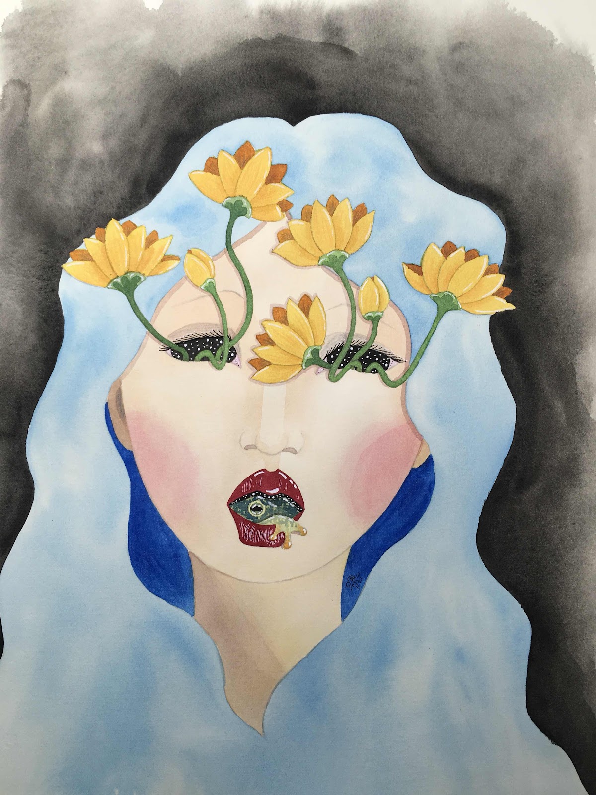
Now to my most recent work, another head.
The plan was to use all watercolours for this one, and to not trace any outlines with marker. You can still see outlines in the end, but they are from the original pencil drawing I conveniently never bothered to tone down to near invisible ;-)
I loved the way the watery hair had turned out, I wanted to just leave it like it was...

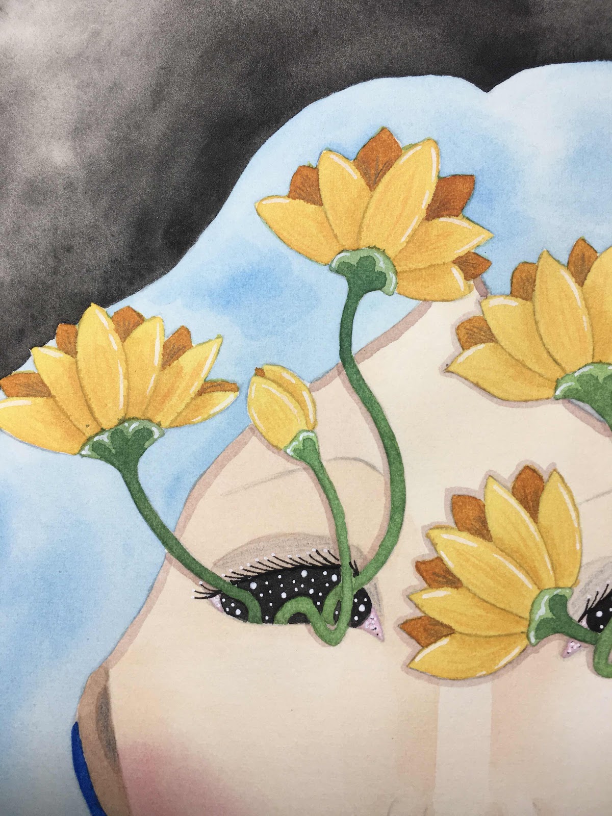
I got the idea with the flowers coming out of the eyes from a drawing my daughter made. She wanted to make a silly face, but then the flowers coming out the eyeballs creeped her out a little and she erased them. She does like the golden lotus blossoms though.

One phrase that kept going through my mind while painting and drawing this was “No mud, no Lotus” which basically means that without the hardship and dirt of the mud the beauty of the flawless flower could not exist. And every time we go through hardships and struggles these experiences change and shape us, make us who we are and ultimately (hopefully) more beautiful and strong. I used the frog as a symbol for transformation, a being starting out in the water (emotion) and after his transformation being at home in both water and air (emotion and mind)

I wanted to call her finished, but she still looked a little plain. I did not want to change her watery hair too much but she needed a little more texture and movement and also a little something at the bottom.

In the end I used mostly watercolours, some coloured pencils and also some acrylic paints. She is painted on a single sheet of Waterford & Saunders Hot Press paper, about A3 size. I really like how she turned out, hopefully I managed to navigate the narrow path between creepy and pretty. All our struggles may be scary for us, but I also want to portray them as a potential for great and needed and potentially beautiful change...
No comments:
Post a Comment