Today is going to be an introduction to Qor watercolours. This is not an official review, nor is it sponsored by Qor. I had heard a lot about these paints, especially about their tendency to spread madly when placed on wet paper and eventually I was not able to contain my curiosity any longer. I think I start to become a watercolour collector of sorts :)
Qor has a couple of introductory sets that they sell, one of them is actually called Introductory set and in theory it contains the basic colours needed for colour mixing. It comes with Hansa Yellow Light, Pyrrole Red Light, Permanent Alizarin Crimson, Phthalo Blue (green shade), Ultramarine Blue and Burnt Sienna Neutral. Whenever I get new watercolours I just love to paint some swatches to see how they mix with each other. This is also a great exercise to keep you arting through artists block when you are just plain out of ideas or inspiration.
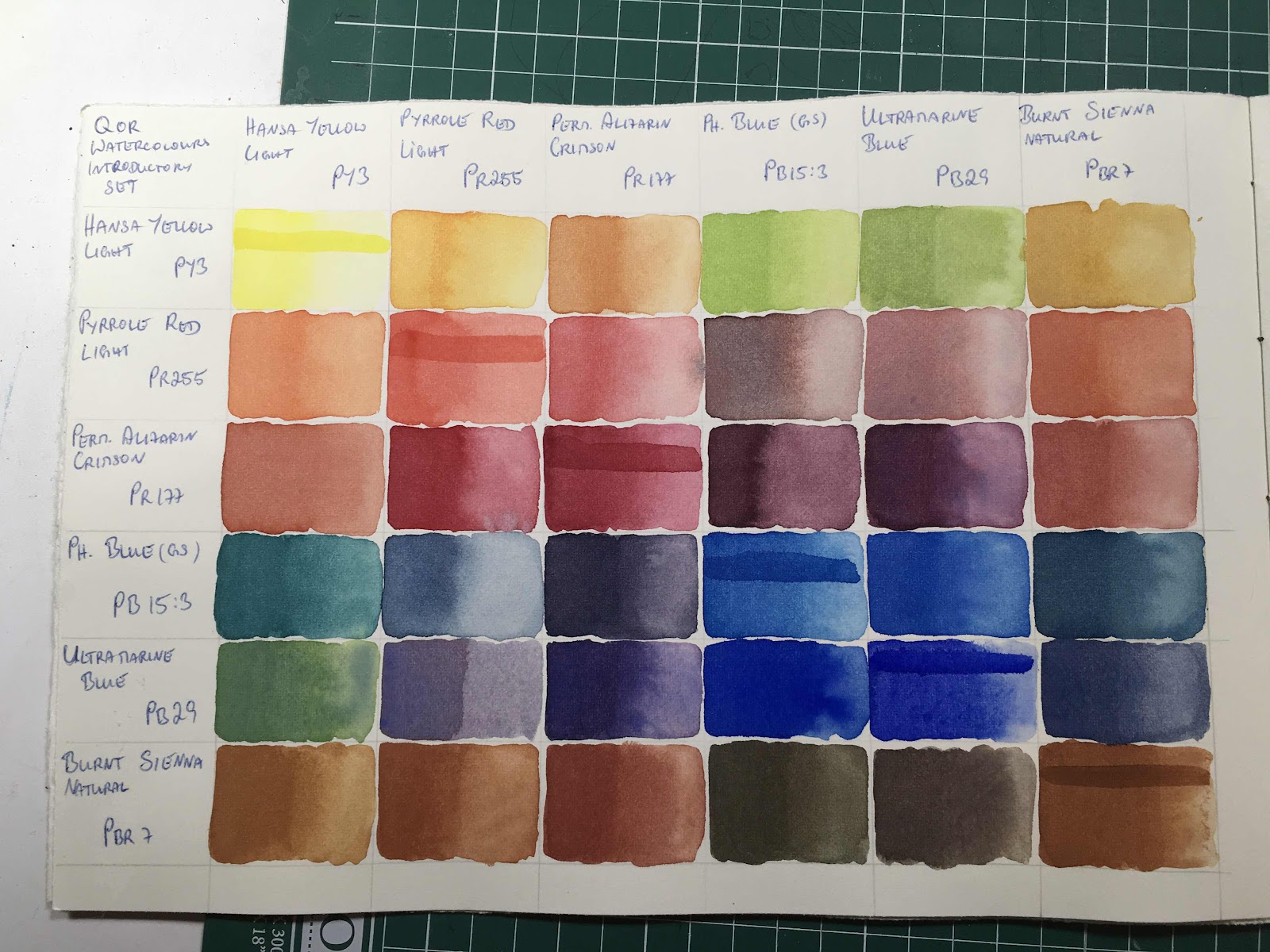
As you can see the colours in this set mix lovely neutral and muted tones. I love all colours, but my favourites are bright and vibrant colours so this set as a standalone would not work for me in a painting. But I also wanted to see this mad flowing capability that I had heard of and so I prepared some wet sample squares in my sketchbook and tried out each colour on its own:
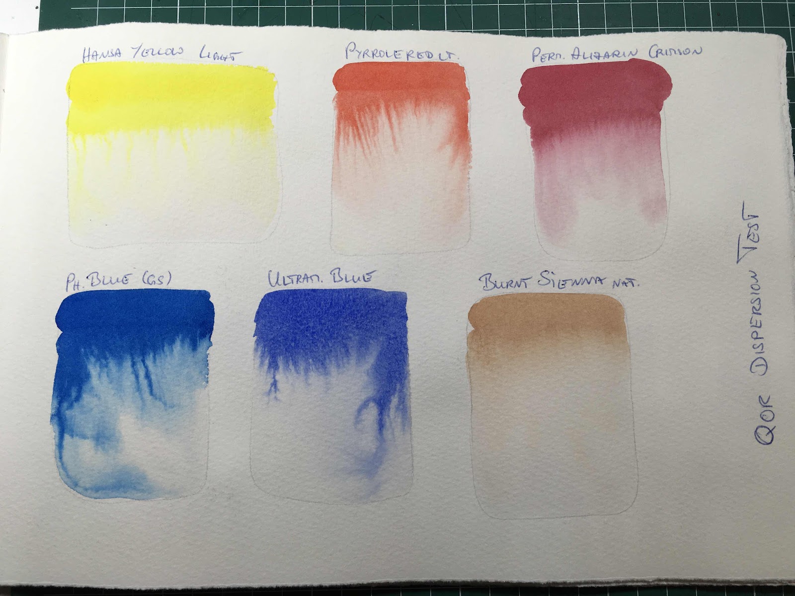
And for me THIS is awesome!!! The feathery fingers in the blues and the Pyrrole Red Light are fabulous and I know I will be getting some awesome use out of this crazy dispersion pattern!
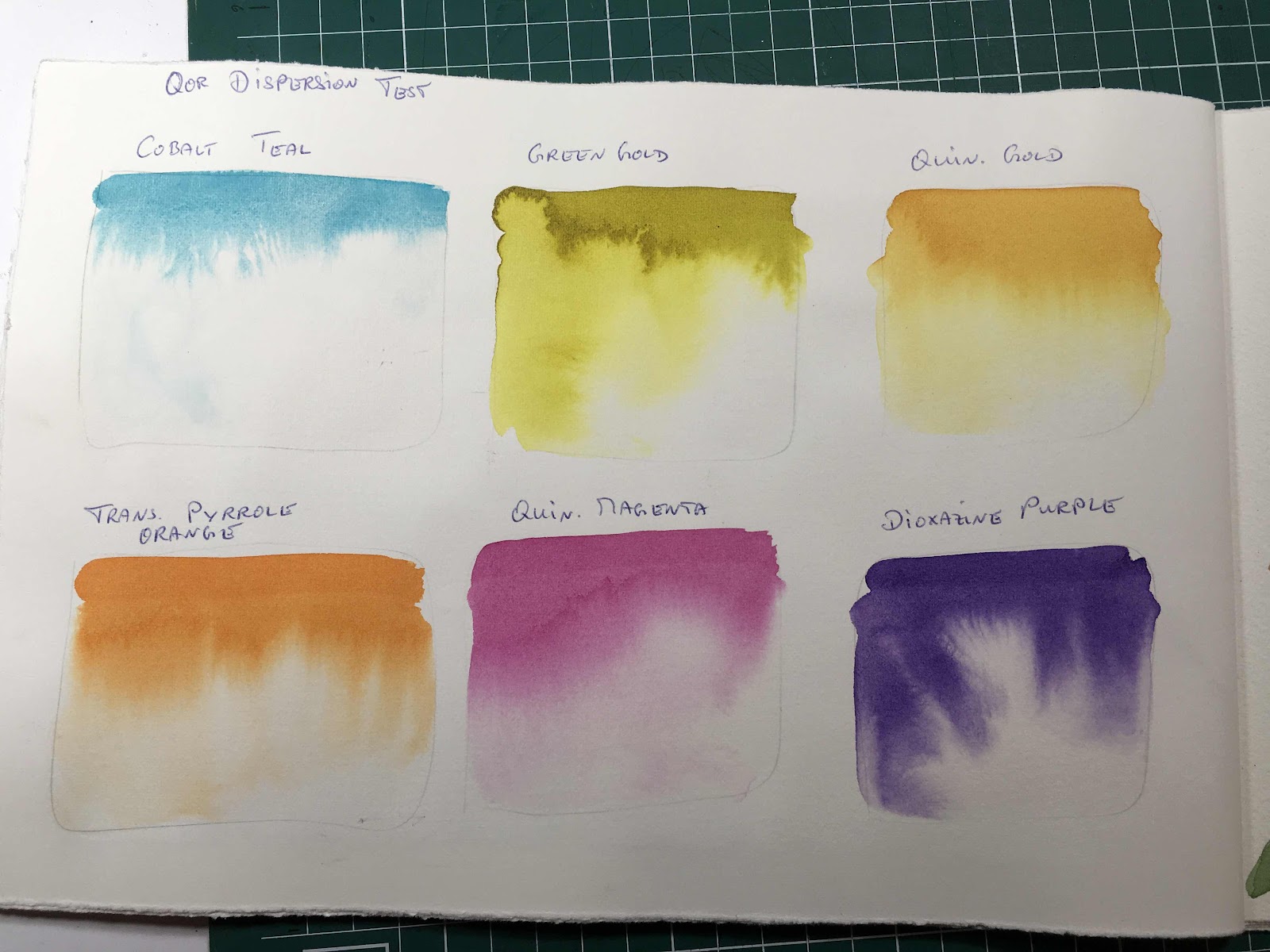
The only thing I was not happy about was the muted neutral colours I could mix with this set, so I went ahead and got myself a second set because it was on offer at Jacksons art supplies. This time I got the High Chroma set and this one has basically all my favourite colours in it:
Cobalt Teal, Green Gold, Quinacridone Gold, Transparent Pyrrole Orange, Quinacridone Magenta and Dioxazine Purple.
Here is the High Chroma set swatch sheet:

I did not anticipate a huge range of vibrant colours that could be mixed with these as the colour selection appears to be rather random, but I got some nice and vibrant oranges and rich yellows out of this.
The dispersion test did not disappoint either, but this time there was no crazy feathering as I got out of the Phthalo Blue and the Ultramarine Blue before.
For me now the next logical step was to combine the two sets into one and swatch them all out together.

I find that I do prefer non-granulating colours, so even though I love the Teal I only use it sparingly because it granulates. And the same goes for Ultramarine blues and violets, I know they are so important for mixing but I just find it hard to befriend the granulation in my paintings. But what happens in the mixing wells with granulating paints is beautiful and magical. When the pigments separate you can see some awesome effects.
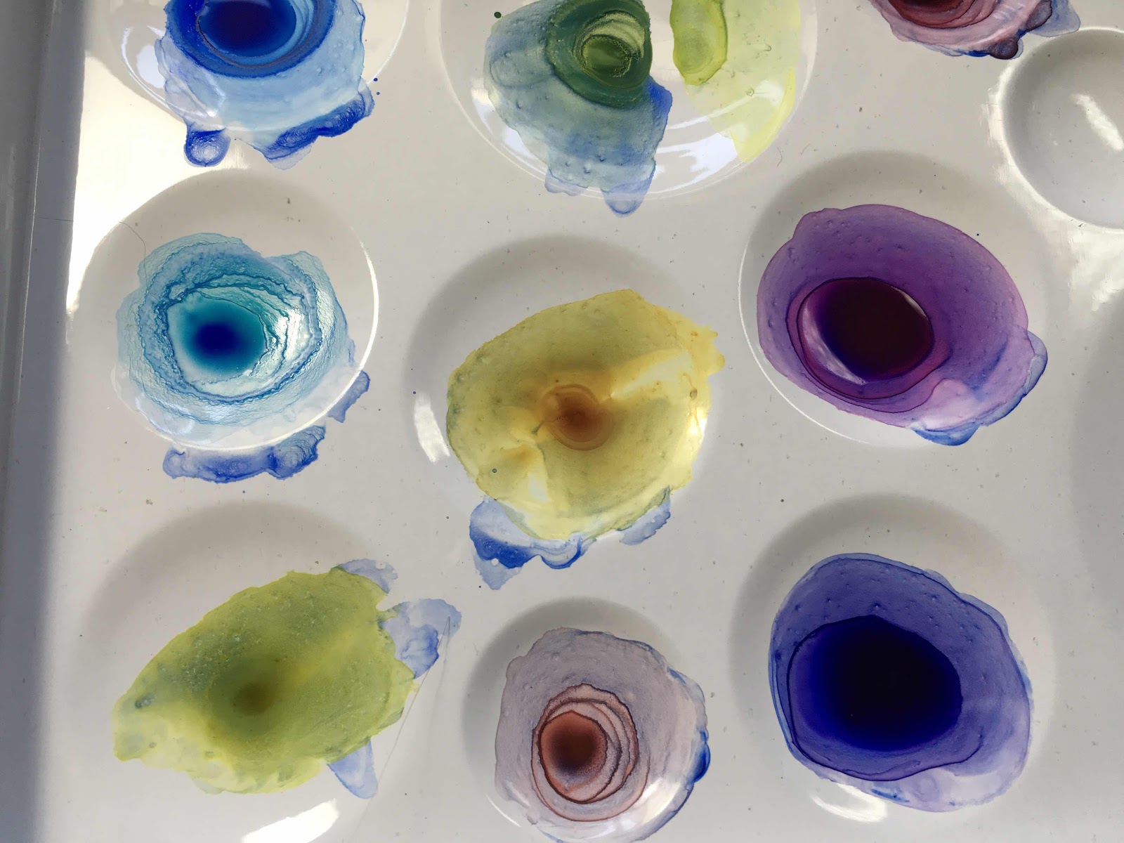
This is the final big swatch sheet with all the 12 colours, it has vibrants and neutrals and muteds. I had expected really strong colours for some reason but I do like the overall softness in all the shades. And I do love the pigment separation that happens with some of the Cobalt Teal mixes, they really need the right subject matter to be put to good use.

These paints are beautiful, on their own and in mixes. They are expensive though and I more than likely will not replenish my stash once the colours get used up. An exception might be the Phthalo Blue simply because the awesomely crazy dispersion, I think I will be holding on to that one ;)
Next post I will show the process of a painting utilising the feathery finger effect.
No comments:
Post a Comment