Wednesday, 5 February 2020

„Headestals“ Art Exhibition


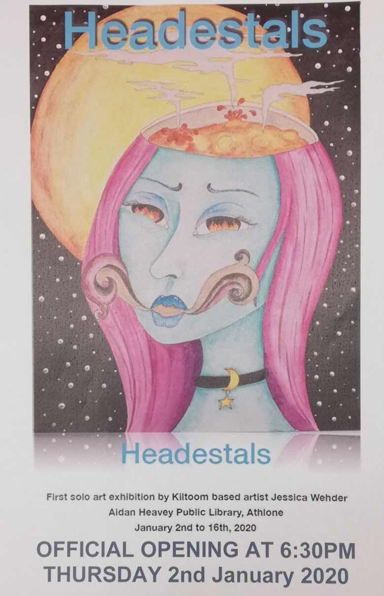
This year started of with great excitement for me: I had my first solo art exhibition. 
Some time during the last year a friend of mine in an art group asked me a very important question, and I think the most important bit about it was how she phrased it.
 She asked me : “Well, Jessica. Wouldn’t you have enough paintings by now for your own exhibition?”
Just a few words, but because she had asked so broadly I actually started thinking about it and counting the pieces I had painted over the last few years. I counted over twenty. And if that isn’t enough for a small solo exhibition, I don’t know what is. It still wasn’t an easy task for me, I had battled limiting self-talk and self-depreciating thought processes for quite some time and mustering up the courage to even ask the location took me a couple of weeks. The only condition that the venue put on me was to work the exhibition around an event if possible, to give it a theme so to speak. I did not want to choose Irelands mental health week in October because I did not want to take it away from the local mental health groups that usually exhibit there during that time so I picked the first two weeks of the next year to align myself with the First Fortnight Festival that highlights mental health and artists.
Now I am very glad it worked out this way, I would not have been mentally ready or even distanced enough from my art pieces to exhibit in autumn. But something shifted during the month of December, and I was able to really appreciate the work I had done over the last years and acknowledge the journey I had undertaken. I was ready now.

First I would like to share the flyer I made with the substantial help of my 12yr old son. He can use the program I needed to edit the flyer so much better than me... (this years to do list: learn how to use photoshop or equivalent)


My son also gave me a hand in typing out all the descriptions I wanted to place underneath each picture. I am not fond of art that induces questions but explains nothing. Some of the paintings I have already posted about here in the past.


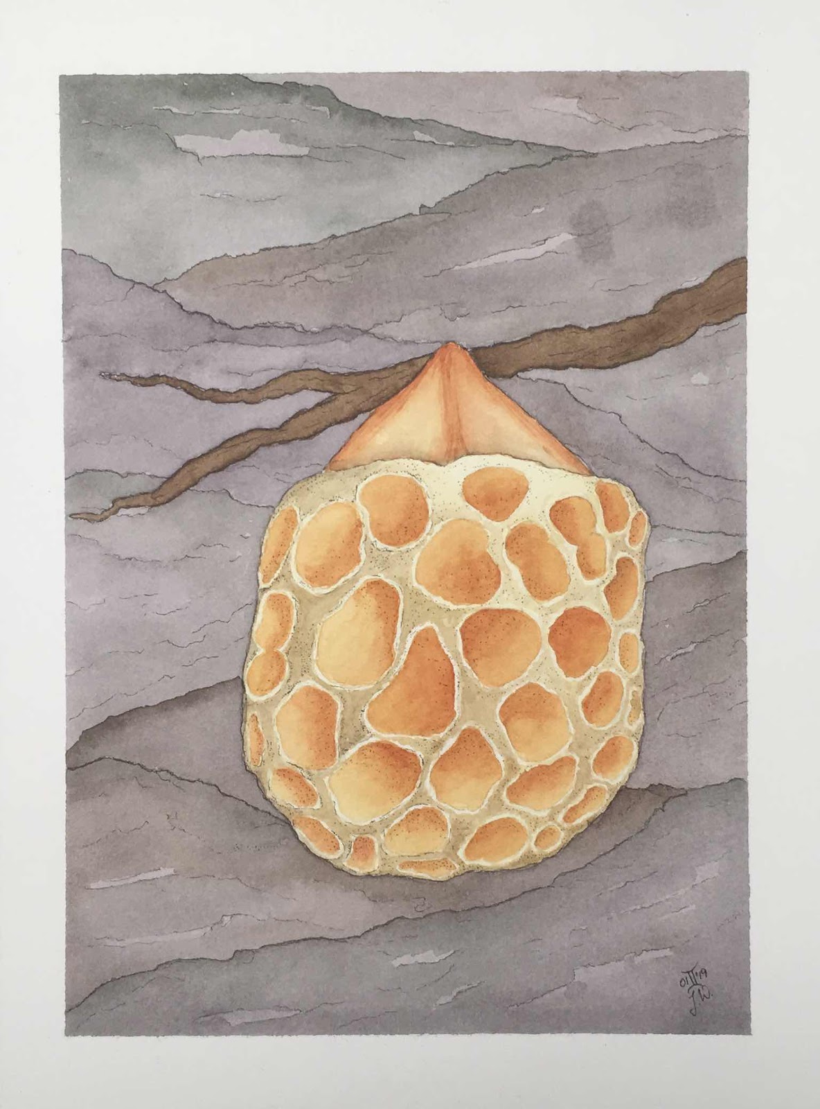
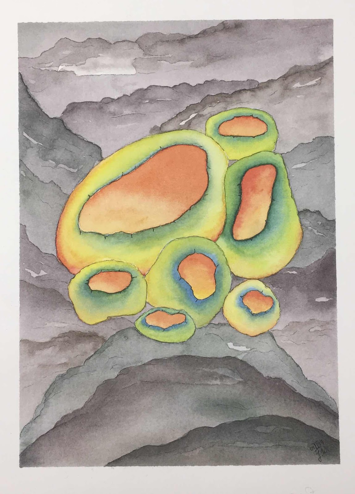
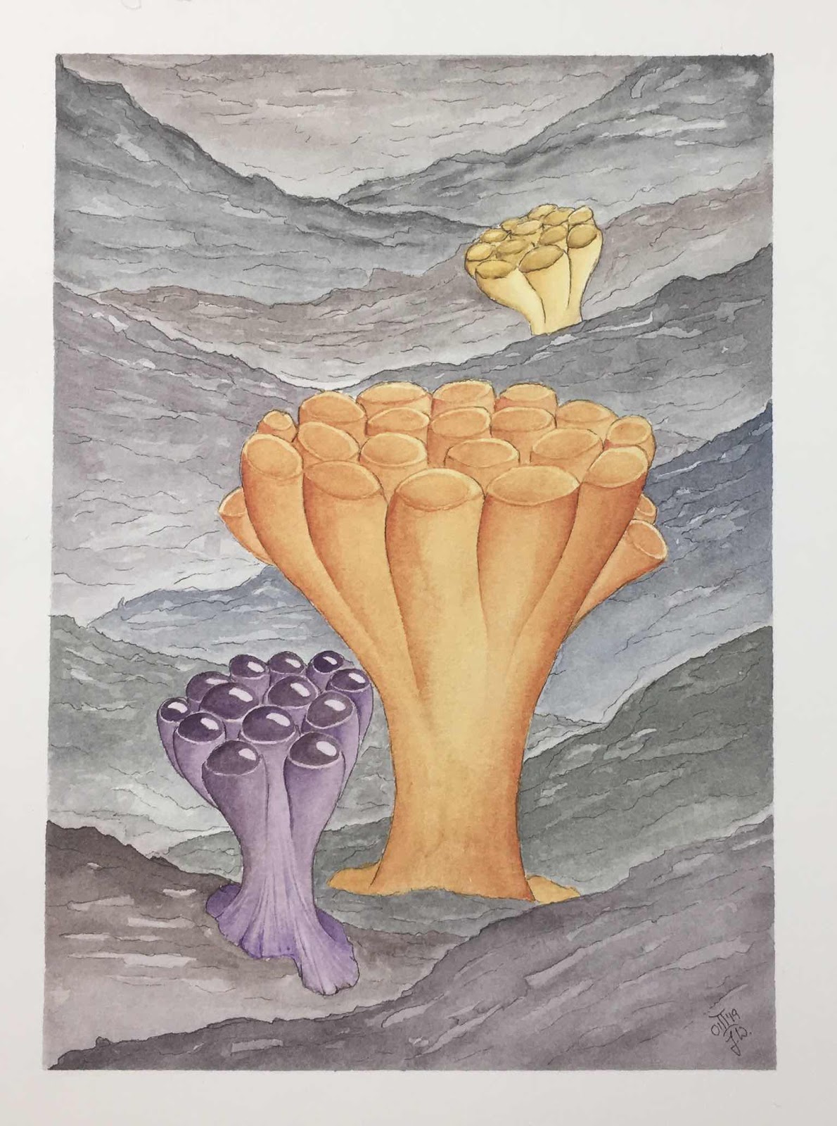
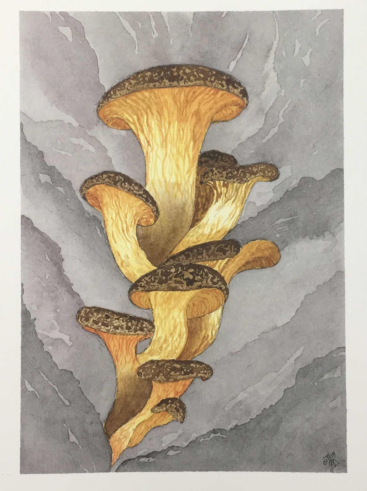
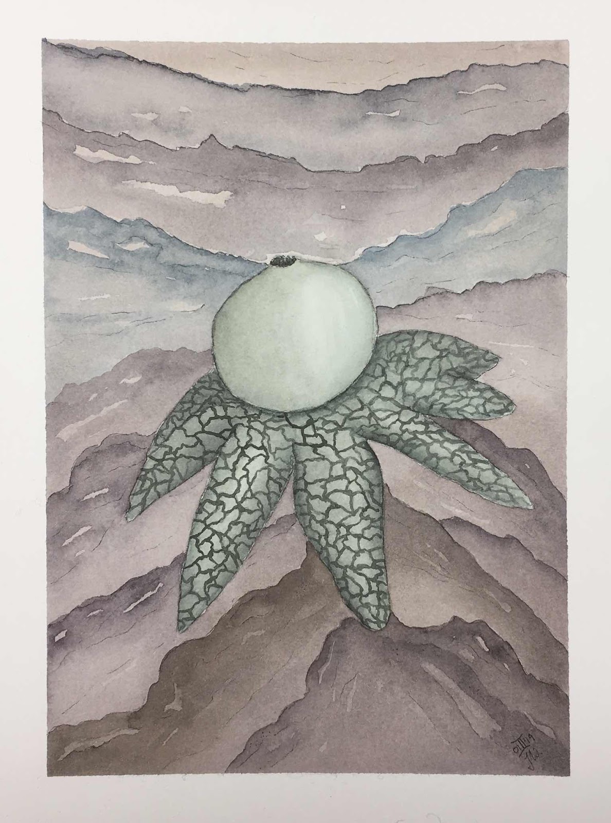
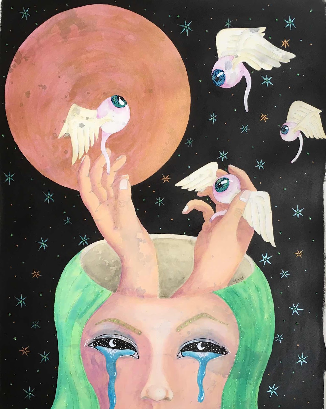
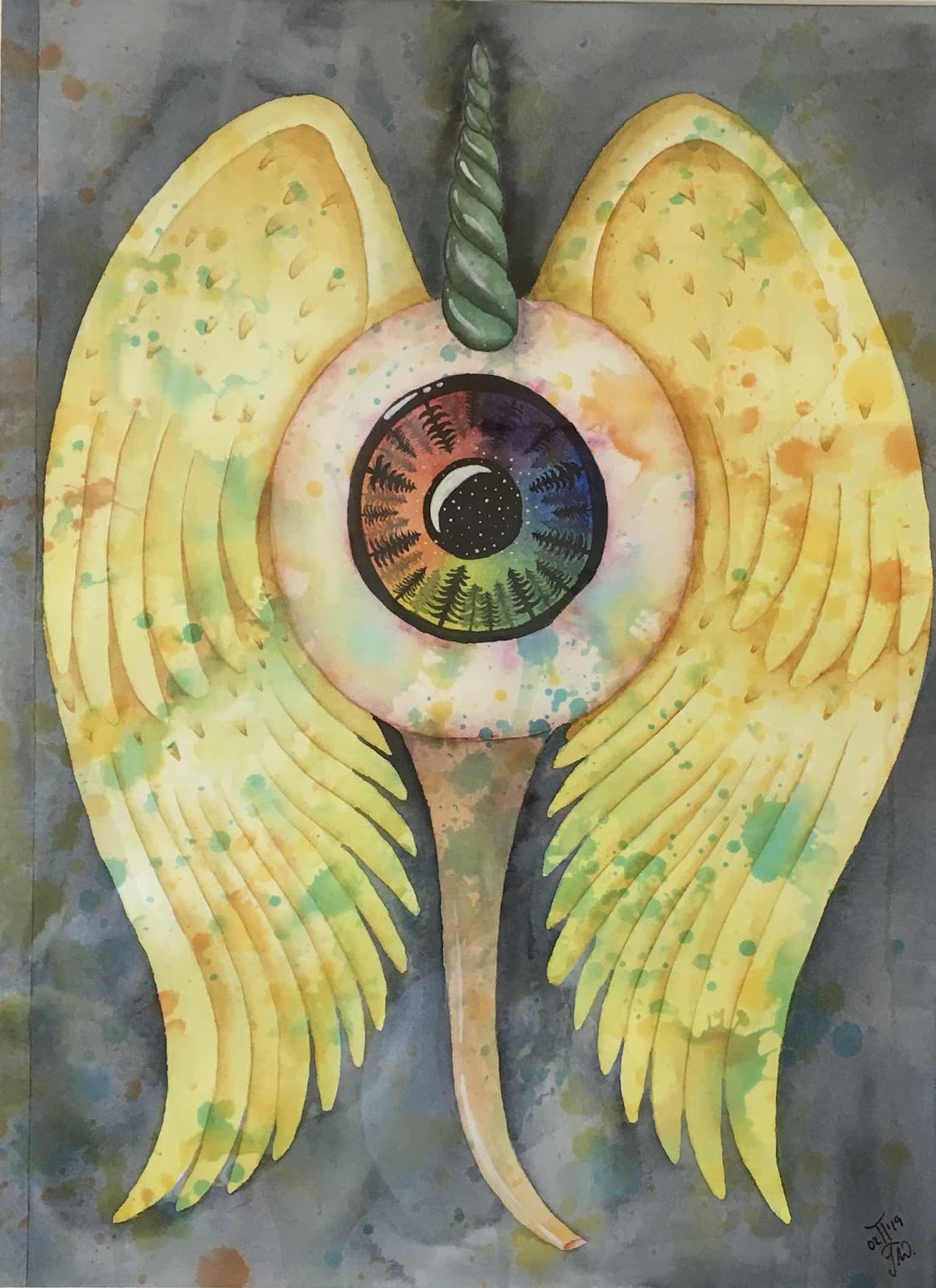
At first I wasn’t sure in which order to place the artwork, and then decided to stick with the timing of them, in order of their making. Because each piece tells a different story and marks a different point in my personal development.


I made all of the pieces available for sale except these three. They are by far my favourites and most important to me. I wanted to have prints of them ready, but they were too large for the local printers scanner and I ran out of time to take proper photographs of them myself. So I decided to keep them a while longer... (to do list: learn how to operate the husbands mighty camera so I can take proper pictures of my own artwork...)


As wide an image as my phone would allow. I have another image that includes all the pieces... and a small boy that ran into the shot and that I couldn’t edit out...


All in all my first exhibition went really well I think. I had 15 paintings hung and over twenty people attending the official opening, not counting assorted children, and some of them had only returned home from abroad that same day. I sold 2 paintings and a lot of people bought prints of the works that I had, and I got my exhibition extended by another week as well. Plenty of visitors left lovely and open comments in the visitors book, I love reading them.

So now I can move on to another project that needs finishing up and that is already 3-4 years in the making. I will definitely post about it here once I am finished with that one and ready to go public ;-)

Wednesday, 1 January 2020

Mushroom Painting Series part 2


What could be a better blogpost in the New Year than to complement and complete a series, so today I am posting the conclusion to my watercolour mushroom series. All paintings are 5“ x 7“, painted with Winsor/Newton professional and Schmincke watercolours on Arches HP 300gsm watercolour paper. I will provide all the information about each fungus to the best of my knowledge, but please, do not (!) take my word for anything without doing your own research. I chose to paint all these particular fungi simply because of the beautiful or odd way they looked, not because they are personal 
friends of mine ;)
DISCLAIMER: I am NOT a mushroom expert, NEVER consume any mushrooms you find in the wild unless either you are accompanied by a mushroom professional or you are a mushroom professional yourself!


I will start off today with the first Mushroom I painted for this series.
Cyttaria Gunnii


This one was one of my favourites to paint.
Crucibulum Laeve, commonly known as Birds Nest Fungus.


And another beauty:
Ramaria Apiculata, listens to the common name Green Tipped Coral Fungus.


I could not believe my eyes when I found pictures of this one, it can be very colourful.
Caloscypha Fulgens


We are probably all familiar with the next one, it is poisonous and should not be consumed.
Amanitha Muscaria, the Fly Toadstool.


Of the next one I found many different pictures and for a little while I was confused as to how it actually looked. Then I found out that it can change its colour and appearance as it ripens and I decided to paint all its stages into one painting.

Metatrichia Vesparium, the Wasps Nest Fungus. It resembles a wasps nest more and more the older and dryer it gets.


And last one for today is a fungus native to Ireland.
Psilocybe Cyanescens, also known as Wavy Caps. As the name suggests this one has psychotropic properties and it also contains a blue dye that makes its stem turn bluish when it is bruised or cut.


Tuesday, 31 December 2019

Mushroom painting series


I find it a little mindboggling that this year is now coming to a close. I have been doing so much throughout the whole year, both as an artist and also in my private family life. So how to ring out the old year here on my blog?

In January of this still current year I started a series of watercolour paintings to really get to know the customised watercolour palette I had  just assembled. All of these paintings are mushrooms, some are odd, some are beautiful, some are edible and some are just naughty. I am adding the name of the mushroom where I know it. All of these are painted with Schmincke and Winsor/Newton professionel watercolours on Arches HP 300gsm watercolour paper.
DISCLAIMER: I am NOT a mushroom expert. Do NOT eat any mushrooms you find in the wild unless you know what you are doing or are in the company of someone who does! I will not take responibility for reckless consumption of questionable fungi and their effects!

So here goes:

My favourite one:
Omphalotus Olearius, commonly known as Jack-o-Lantern Mushroom


Morchella Esculenta, commonly known as a Morel Mushroom and highly edible to the best of my knowledge.


Hydnellum Peckii, commonly known as Bleeding Tooth Fungus. Yes, it really looks like it has droplets of blood oozing from its pores.


Astraeus Hygrometricus, commonly known as Barometer Earth Star Fungus, edible.


Clathrus Cancellatus, I do not know anything about this mushroom, I painted it because it is shaped like an organic netlike structure, with the vibrant orange outside and a really weird sort of brownish inside.


Okay, the last one for today comes with a warning. If you are a prudish sort of person, do not scroll down further!

Phallus Impudicus, also known as the Common Stinkhorn. Very fitting names if you ask me...


Sunday, 29 September 2019

A Little Perspective


Hello everyone. 
I haven’t posted anything new here on my blog in a while, so I thought now is as good a time as any to share some more paintings I created.

A couple of months ago I was driving in my car and I was listening to music on my iPod. The song that played was Gehenna by Slipknot. I noticed a passage in the lyrics that resonated with me: 

“Free my severed eyes”

And this really got me thinking. How in a way it would be pretty awesome if one actually could remove ones eyes and have them flying off and upwards, but still being able to see with them. we would get a completely different view over what is, a totally different perspective on what is going on. And so the following painting was born.


She is not actually crying from sadness, I was aiming at showing an overflow of emotion that is released through her tears. She does appear to be sad by just looking at her, but she must not neccessarily be sad. She is releasing a flock of flying eyes in order to gain a different viewpoint, or perspective, on whatever it is she is currently mentally invested in.

And would it not be great to have a little flock of eyes as pets? I know I would love it ;-)


I thought my kids would be put off by the painting but on the contrary. I was telling them I was thinking of painting a large flying eye, and one of my sons had the idea to make it a unicorn eyeball. 
So I did...


You could also call this an intergenerational piece, as my son participayed with the idea, and I painted it using some paints from my grandmothers palette...

The unicorn eye looked too good and angelic to be true though, I felt it needed some sort of a counterpart. I was reminded of the concept of shoulder angels and shoulder devils that seem to influence our decisionmaking sometimes.


This idea of gaining a different perspective and looking at a problem or a thought from a different viewpoint is still very strong with me and a very important part of my toolset to manage anxiety.

But the best thing? All of this is based on me hearing the lyrics to the song wrong! I posted the link to the song with lyrics, and you will notice that he does not sing “free my severed eye” but “free my severed heart” instead. I think I simply got the message I needed to hear at the time; and I still hear “severed eyes” everytime I listen to the song ;-)


Sunday, 12 May 2019

Upcycling a lost matrioshka doll


About two or three years ago, on a parking lot, I found a nesting doll. Not the whole set, just the littlest inside doll, the one that lives at the very heart of a set of nesting dolls. The poor thing was wet from the rain, the paint peeled off in flakes and it looked quite battered. I picked her up and affixed her to my dashboard with bluetack. Maybe one day I might give her a new coat of paint?

She has been living on my dash ever since, until a few weeks ago. This is her:


Not too bad one might think, but this is the true extend of the damage I found her with, the paint was all flaky.


To make he surface suitable for painting I sanded off all her old paint and gave her a good clean to get rid of all the dust.


Now, a few layers of acrylic paints and white posca pen later...

Say hello to Maddy, the shy little octopus girl...


She has the most pleasant and kind personality, in no time at all little Maddy made a friend: Armand has been with me for a good while as well. He was made by a friend I met over on Afa.com, and he immediately took a shine to the little Octopus girl. Now the two of them have a great time watching me drive the kids around from their prime position on my dashboard ;-)


DIY Sketchbooks

I had lost my creative motivation over the last couple of weeks. 
I was sick with a headcold and a cough, most of my family were also sick with the same, and to top it all off the outside of my house turned into a building site. We urgently needed to get exterior insulation and for that some of my windowsills needed to get demolished... the jackhammering noise was unbelievable (but neccessary)!

I just could not get myself to paint or even just draw something, when by coincidence (yes coincidence) I happened to pass my local art supply shop and of course I went in. They had just gotten some Canson Imagine Mixed Media paper pads in stock, my favourite smooth mixed media paper! And the big A3 size pad was also quite good value so I went for it.

When I feel down it always makes me happy to make a book. The process contains a lot of repetitive tasks and movements and I find this very calming for the nerves and for the mind.

Here are some great tutorials that cover the basics for sewing the signatures and folios together with different stitches, they are by Sea Lemon, and here is her Coptic stitch sketchbook. These two really form the basics for all my diy books.

The first book I made is an A4 size book, with hard cardboard covers. I used printed papers and some pretty duck tape for the outside and the inside covers.


The spine with the stitching.


And the inside of the cover, with some Roald Dahl themed paper...


I made two of this size sketchbook, one I gave to another member of my art group. And by coincidence her previous sketchbook was full just a day or two before I gave her mine; sometimes it feels good to be in the right place at the right time :)

I also made a couple more, smaller sketchbooks. I had found a lovely tutorial on how to make a small watercolour sketchbook with a leather cover, and the pageblock could be removed and replaced. If there is one thing I look for in sketchbooks and journals it is the reuseability of the covers. Travellers notebooks are right up my alley, fully customisable to whatever I need. This is the sketchbook tutorial I used as inspiration for the following books.

So I got out my remaining hard cardboard for the covers, fabric and I also cut some more of the Canson paper. I made 3 books in total, one with a blue japanese style fabric with a crane bird on it, the girl this book was intended for had drawn crane birds before. Then a lovely fabric with whimsical sun and moon designs, again aimed to fit the interests of the intended recipient. And I also had enough fabric of this left, that I could make another book for myself. 

This is my own little one from the front


and the back; as mentioned before this cover was made with left over fabric and ended up a little offcentre.


This journal was built to have an interchangeable paper block inside and so needed a little something to connect the front and back cover. I used a little fabric trim with insect design, the strip of trim is attached to both covers and the paper block is not; you will see that in the next picture...


This next picture allows you to see the inside of the cover with the trim holding the covers together and also the elastic that keeps the paper inside the cover.


And then the paperblock and the covers separately. I personally love most methods of binding that allow me to reuse the outside and replace the inside at will and use any paper I choose.


I hope you enjoyed my newest scetchbook process, and if you are a recipient of one of them: Happy Arting !


Wednesday, 20 February 2019

Homemade Shimmer Watercolours

I have to admit, I cannot not try out stuff I come across on the internet. And I also have to say that I absolutely love glitter, and shimmery effects, I am a fan of all metallic colours.
So I had a look at a few videos -because that is where one learns new skills these days- to check out what minimal basics I would need to make my own shimmer paints. It makes me feel good whenever I already have all I need at home and not have to buy extra supplies.
One very good starting point might be Oto Kano , she has a youtube channel and she makes her own watercolour paints, there is Denise Soden with her channel In Liquid Colour who looks at pigments and colour compositions with great detail, and then I also found this video here, showing the very basics (2 ingredients) needed for watercolour paints. The guy in the second video has a lengthy calculation about how much money he could save by making his own paints, and while I do agree that it can save you good money, it might also mean that you end up with copious amounts of one colour that you might never use up on your own.
Anywho....
Of course I dove into my stash of art supplies to see what I could come up with and behold ! I found several little jars of mica pearlex powders... and I do have a couple of tubes of watercolours. What I did not have was a free small palette or spare tin, or clean halfpans not yet spoken for. And if I do not have a palette I am going to make me one...


All it takes is some elderly tupperware and some hot glue.

My first colour to try out was Quinacridone Gold, one of my favourite colours. In the picture I have the Quin. Gold by Schmincke, but I really used the one by Winsor and Newton, the two companies use different pigments to make this colour. This is good to know in case I run out of one in the middle of a painting...


The pearlex mica changed the shade of the gold from Yellow to a bit of a greeny hue, but I managed to get a nice little shimmer into my paint. I had already picked out a few more combinations, being careful to match the shade of pearlex to the colour, a list of my pairings will be at the end of this post.


Getting messy with paints, powders, spatulas and swatch cards. I am loving this... :-)


And these are my finished paints, a little collection of 10 shimmer paints, more or less successful. The yellow did not turn out as shimmery as hoped and neither did the Magenta in the top row. I did not yet get to try them in a painting so they might still turn out interesting.


And here the finished swatchcard, I took pictures at different angles to show the shimmer effect where it is noticeable.


And here is the list of paint/pearlex pairings:

1. W/N Quinacridone Gold (Pr206,Pv19,Py150) + 665 Sunset Gold
2. W/N Winsor Yellow (Py154) + 641 Orange Pumpkin & 651 Pearl White
3. W/N Quinacridone Magenta (Pr122) + 642 Salmon Pink
4. W/N Winsor Violet (Dioxazine) (Pv23) + 664 Reflex Violet
5. Schmincke Neutral Tint (Pr122,Pb60/Pbk7) + 646 Mink

6. W/N Quinacridone Gold (see above) + 660 Antique Bronze
7. Schmincke Burnt Umber (Pbr7) + 660 Antique Bronze
8. W/N Quinacridone Magenta (see above) + 643 Pink Gold
9. Schmincke Phthalo Blue (Pb15:1) + 647 Sky Blue
10. Schmincke Neutral Tint (see above) + 651 Pearl White

I love how the two Neutral Tints look completely different now with the different mica powders in them, the Mink has a little secondary green shine to it. It will be fun to paint something with them.